In This Article
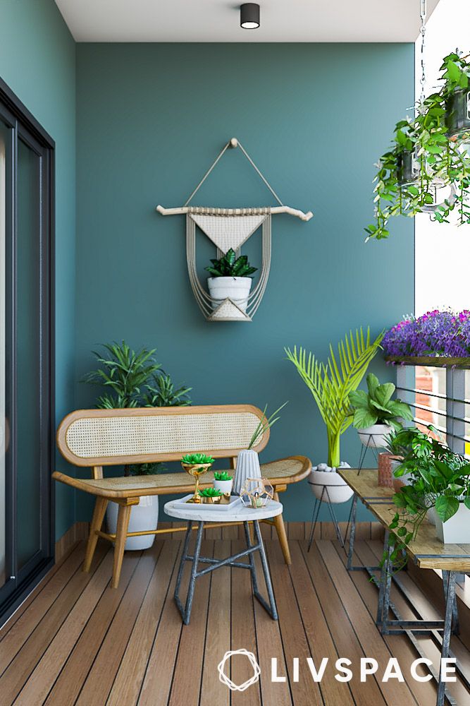
- #1: Ocean teal, grey and white
- #2: Orange, yellow and white
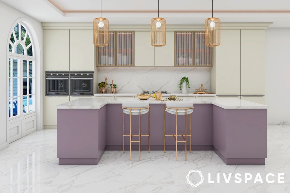
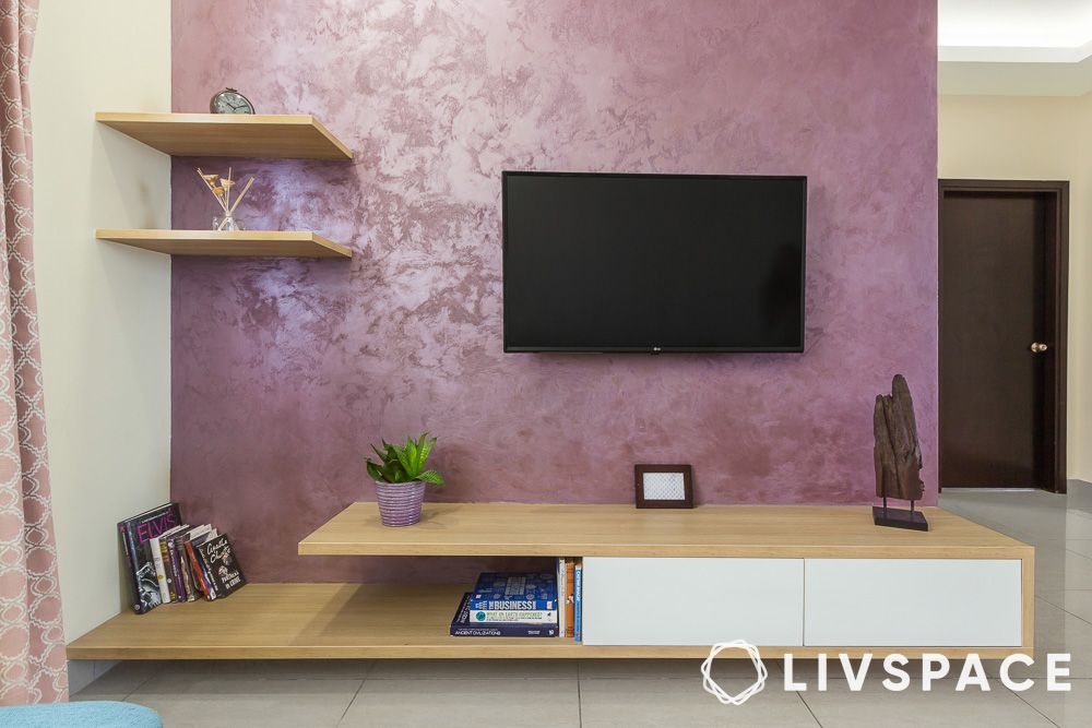
- #3: Mauve purple and white
- #4: Dark and light beige wall paint colour idea
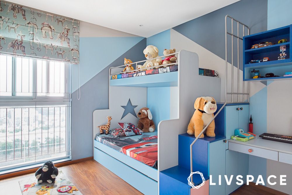
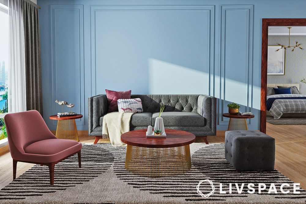
- #5: Blue, grey, yellow and pink
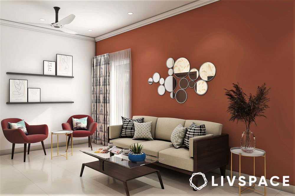
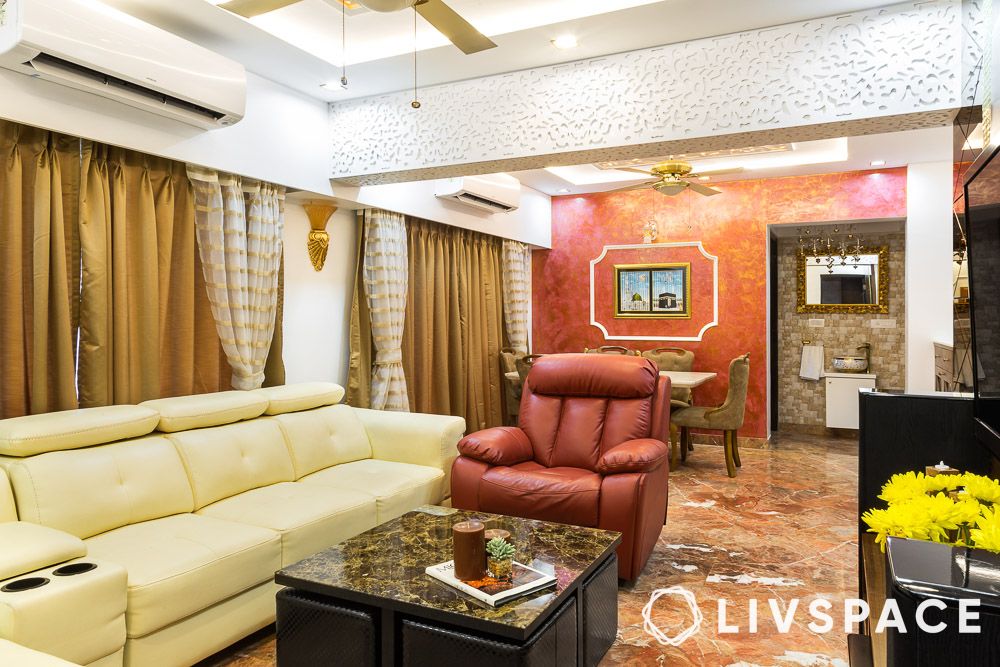
- #6: Red and white
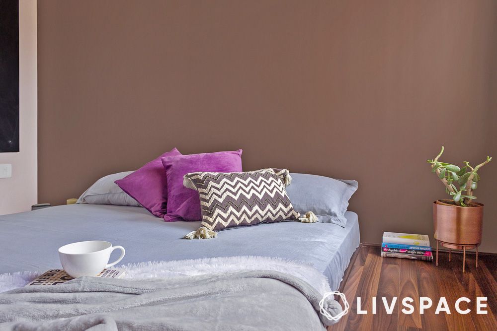
- #7: Chocolate brown and off-white
- #8: Bright teal and white
- #9: Lime-washed grey and white
- #10: Capri blue and tangerine
- #11: Royal blue and muted yellow
- #12: Lilac and pastel orange
- #13: Sage green and turquoise
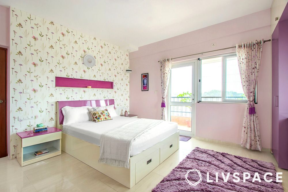
- #14: Dark purple and white
- #15: Russet brown and white
- #16: Sky blue, livid grey and white
- #17: Lilac, white and off white
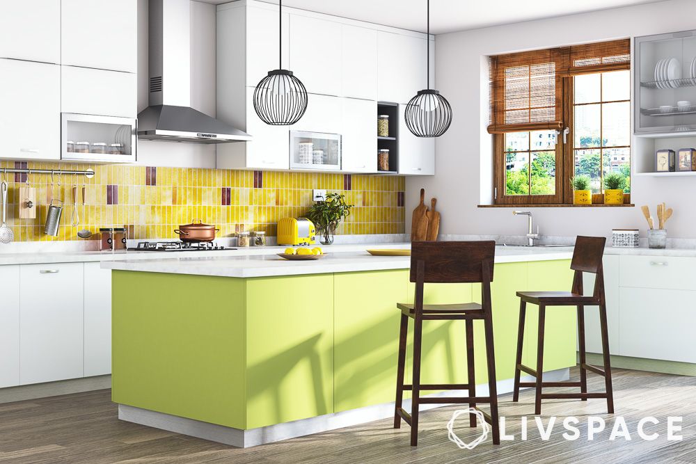
- #18: Lime green, yellow and white
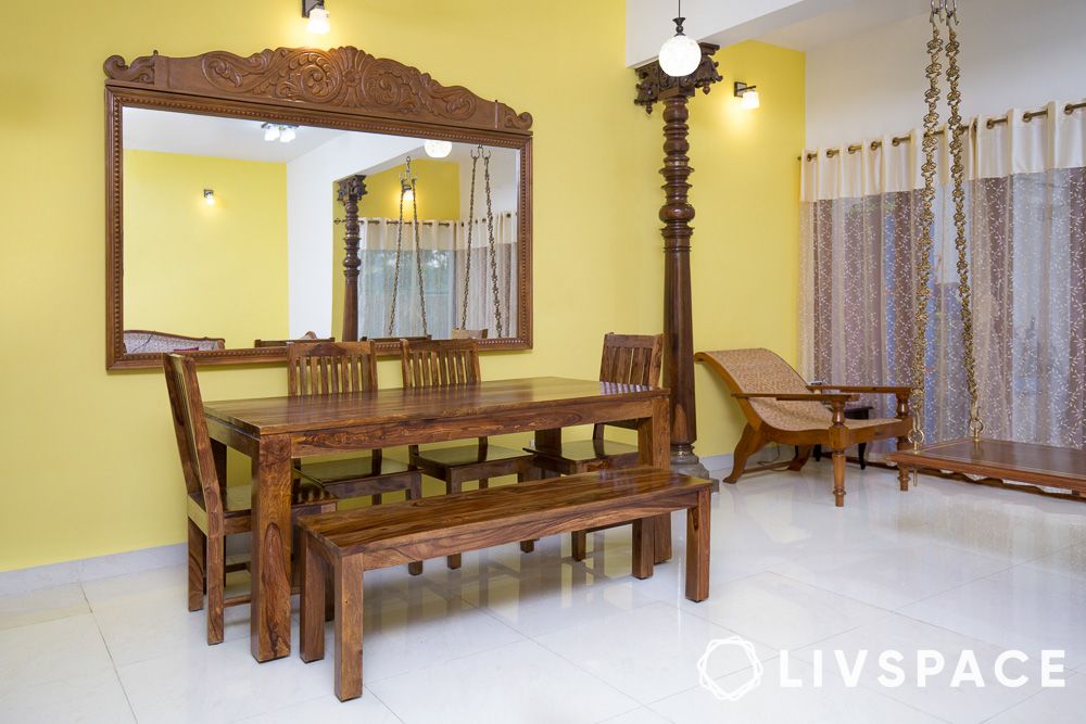
- #19: Yellow, white and blue
- #20: Forest green and white
- #21: Grey, green and white
- #22: Pinks and grey pastels
- #23: Mash of blue and yellow
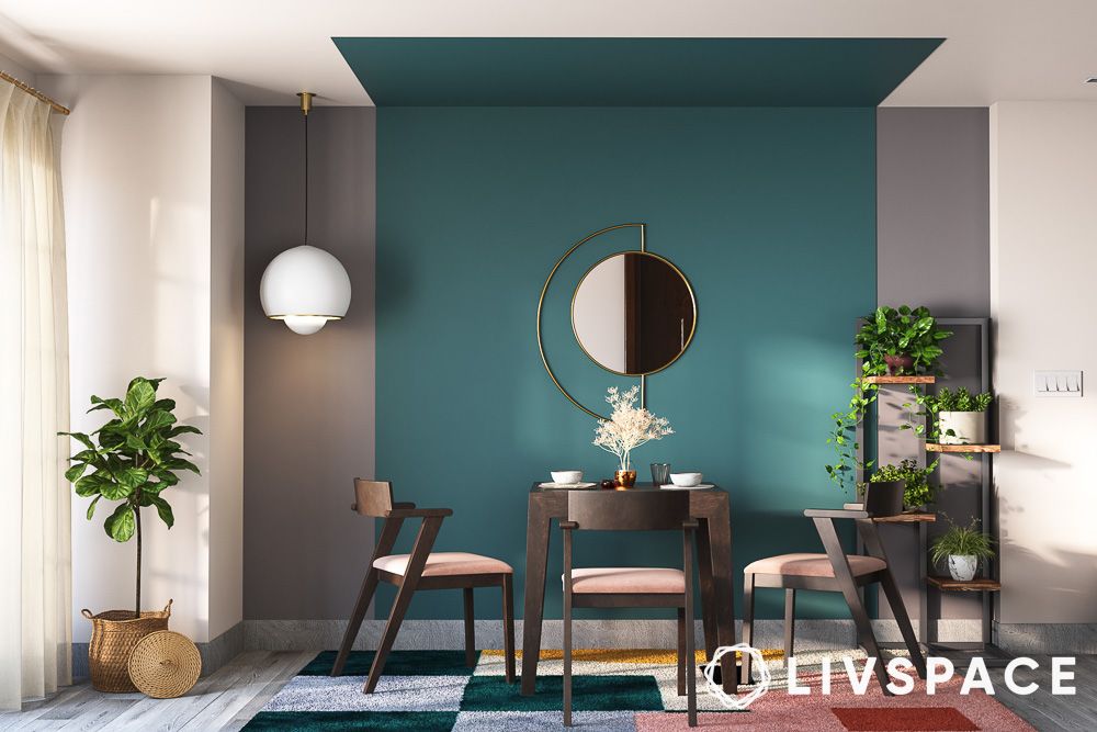
- #24: Teal and cream
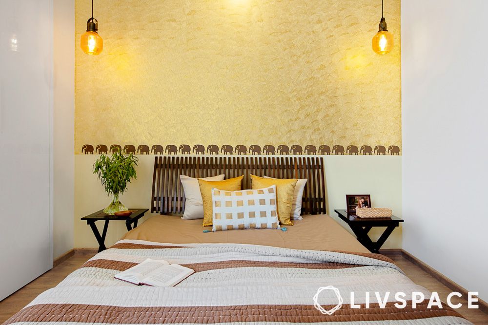
- #25: Yellow, brown and white
- #26: Light green and lemon yellow
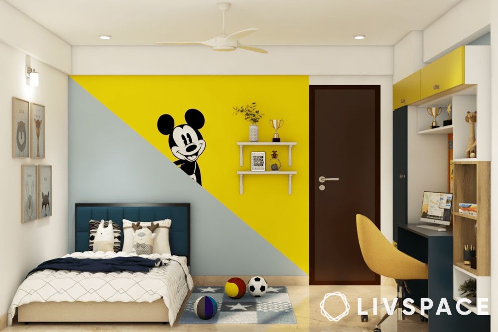
- #27: Yellow and grey
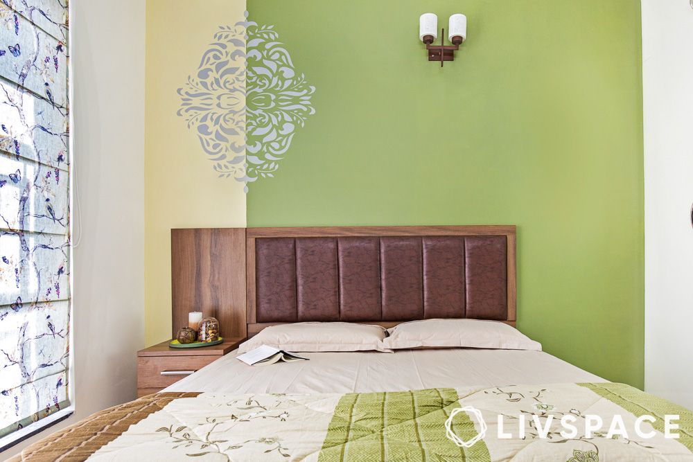
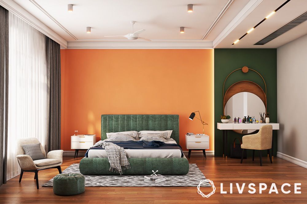
- #28: Orange and green
- #29: Textured orange and gold
- #30: Dark purple
- #31: Dark blue
- #32: Red
- #33: Textured emerald green
- #34: Light blue
- #35: Light purple
- #36: Greenish-yellow
- #37: Bright yellow
- #38: Mustard
- #39: Orange
- #40: Pastel blue
- #41: Grey
- #42: Magenta
- #43: Crimson
- #44: Avocado green
- #45: Pristine white
- #46: Cream
- #47: Peach cream
- #48: Textured gold
- #49: Rustic sky blue
- #50: Powder blue
- #51: Dark burgundy
- #52: Light turquoise
- #53: Midnight blue
- #54: Cerise pink
- #55: Peach bud
- #56: Sage green
- #57: Textured green
- #58: Baby pink
- #59: Coffee brown
- #60: Cement grey
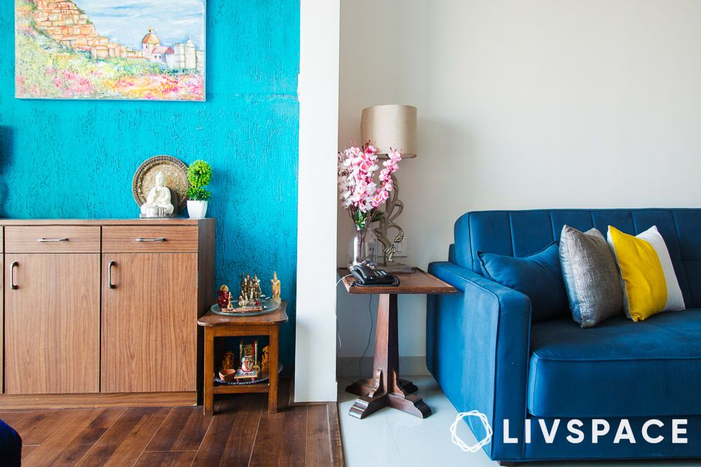
- #61: Teal
- How can Livspace help you?
Choosing the right paint colour for the walls of your home can feel like walking a tightrope—one wrong step and the whole look can be off. But fear not! We’re here to guide you through the maze of hues and shades with some fantastic, tried-and-true single and multiple interior house colour combinations that will make your home a sight for sore eyes. So, let’s dive into the rainbow and find the perfect palette for you!
If you don’t want to commit to a single colour, mix and match different colours for an aesthetic uplift. Let’s explore a spectrum of home colour combinations that will make your home feel as inviting as a warm hug.
#1: Ocean teal, grey and white
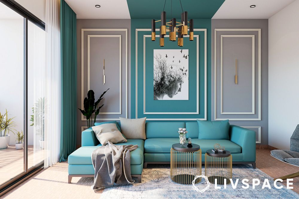
Ocean teal, grey, and white as an interior house colour combination bring a refreshing coastal vibe to your home. This trio of colours for a home is reminiscent of a serene beachside retreat. Teal and grey offer a soothing contrast, while white brightens the space, making it feel open and inviting.
#2: Orange, yellow and white
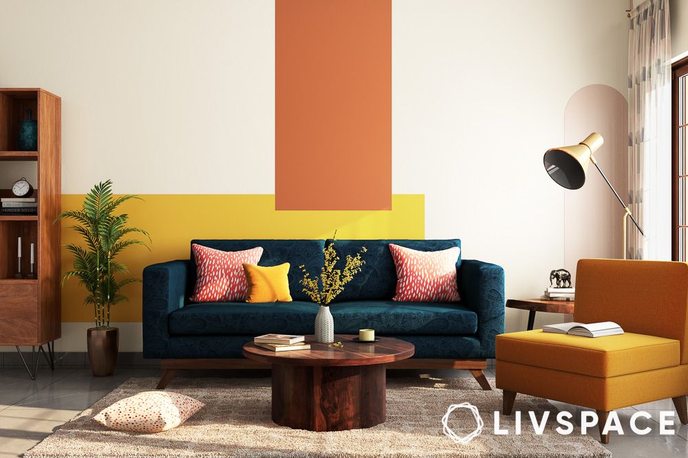
If you’re looking to add a burst of sunshine to your home, orange, yellow and white paint colours for your home is the way to go. This vibrant combination is full of energy and positivity. Perfect for living rooms, kitchens and dining areas, it’s sure to make every gathering feel like a celebration.
#3: Mauve purple and white
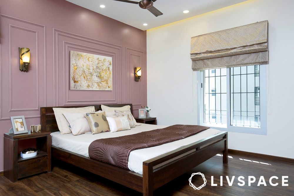
This interior house colour combination brings a soft, romantic touch to your home. Mauve adds a gentle, sophisticated pop of colour, while white keeps the space airy and light. It’s perfect for bedrooms and living rooms where you want to create a serene, inviting atmosphere.
#4: Dark and light beige wall paint colour idea
For those who love a more subtle approach, dark and light beige paint colours for your home are your go-to. This combination is all about elegance and simplicity. It’s like wrapping your home in a warm, cosy blanket. Use light beige for the walls and dark beige for accents like furniture and curtains to create a balanced, cohesive look.
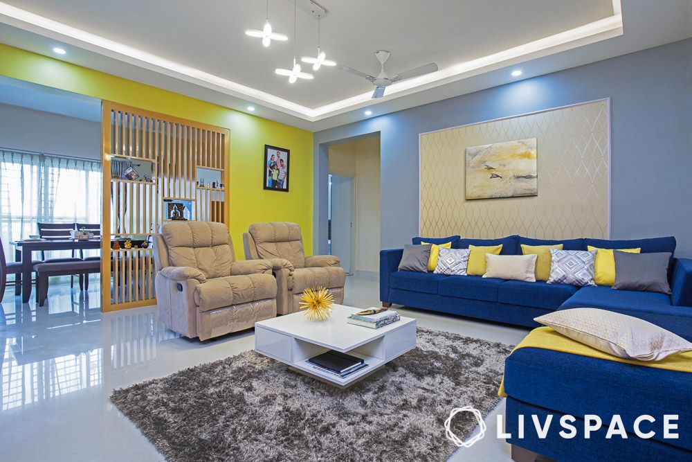
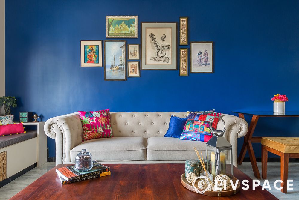
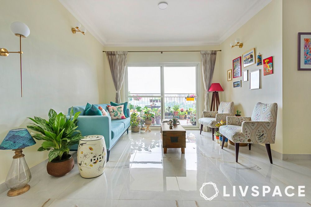
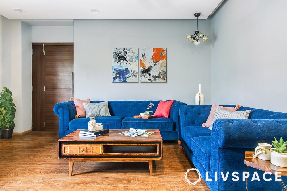
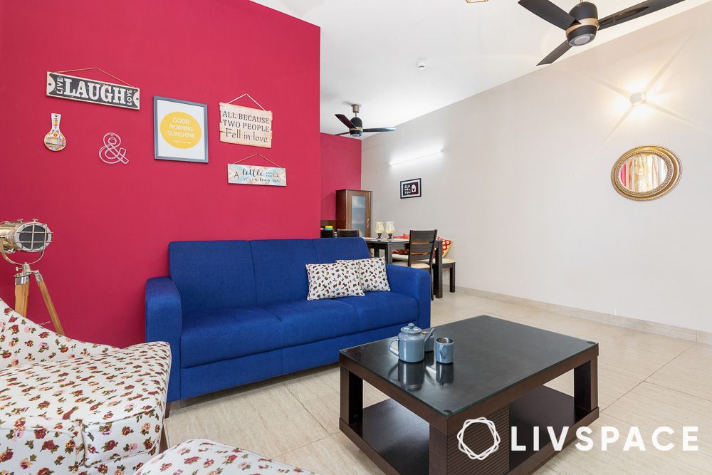
#5: Blue, grey, yellow and pink
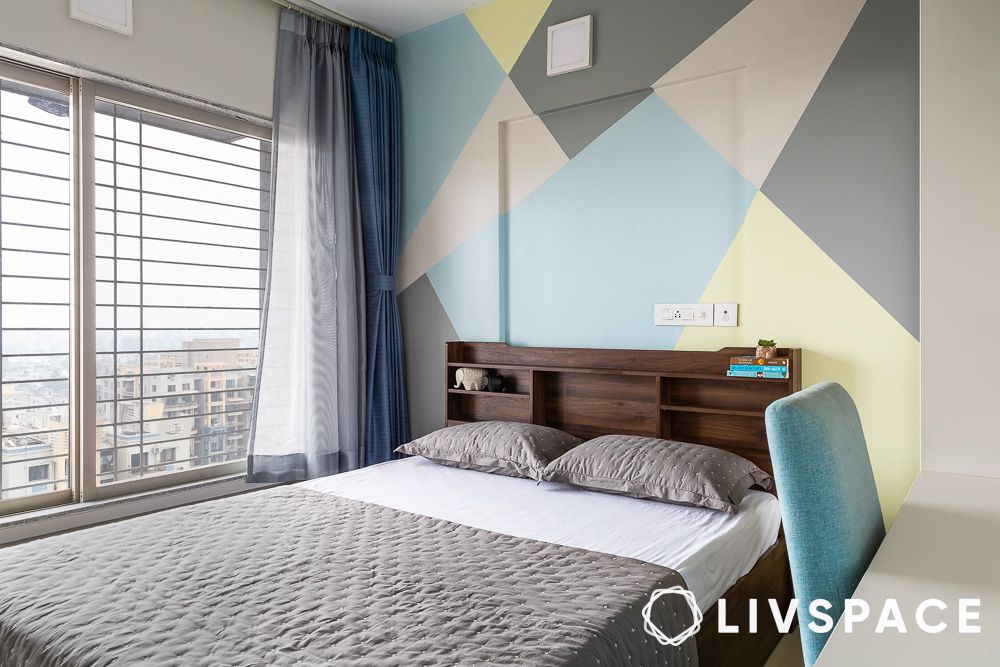
When using multiple colours, try to use an abstract design to not overwhelm the entire space with loud colours. Blue, grey, yellow and pink might sound like a lot, but this interior house colour combination can be surprisingly harmonious. Blue and grey form a calming base, while yellow and pink add playful accents. Use this combo in spaces where you want to balance serenity and cheerfulness, like a home office or a child’s bedroom.
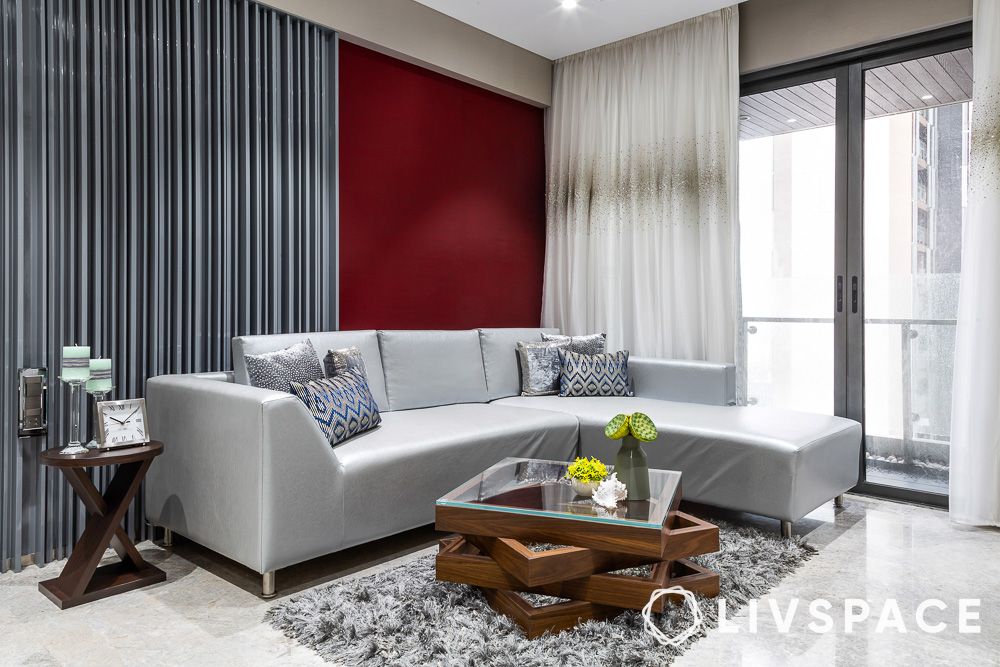
#6: Red and white
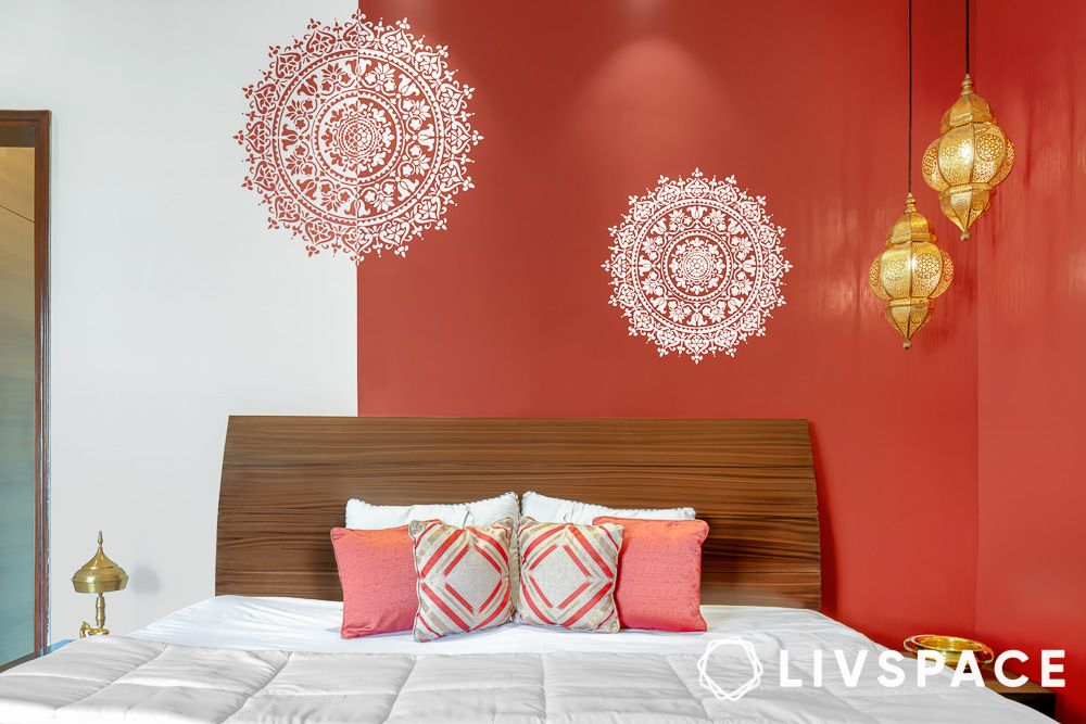
The combination of red and white is a classic and timeless option for paint colours for walls. Red brings passion and energy, while white balances it with purity and calm. This striking combination is perfect for making a statement in your living room, bedroom or dining area.
#7: Chocolate brown and off-white
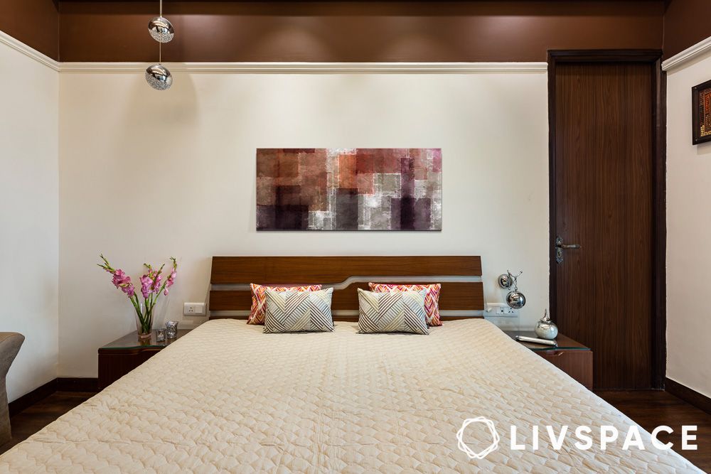
Chocolate brown and off-white are like a comforting cup of cocoa on a cold day. This rich combination of colours for your home adds depth and warmth to your space. Use it in rooms where you want to create a cosy, inviting atmosphere, like a bedroom or a study.
#8: Bright teal and white
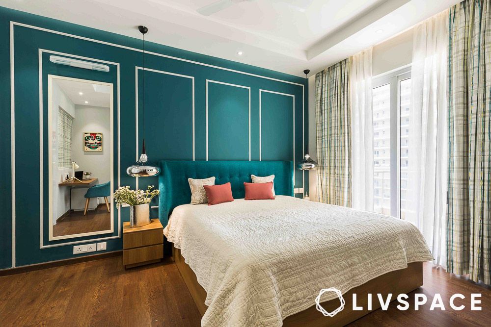
Bright teal and white are all about freshness and vibrancy. This combination is perfect for spaces where you want to feel energised and alive, like a kitchen, bedroom or bathroom. Teal brings in a pop of colour, while white keeps it clean and crisp.
#9: Lime-washed grey and white
For those who prefer a more rustic or industrial vibe, this wall paint colour combination of lime-washed grey and white is right up your alley. It brings a touch of chic and understated elegance. It’s perfect for creating a calm, soothing environment in any room, making it feel like a cosy, modern retreat.
Also Read: 14 Types of Paints and Finishes: Which Ones Best Suit Your Home?
#10: Capri blue and tangerine
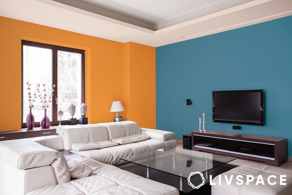
Capri blue and tangerine are bold and adventurous. This lively paint colour combination for walls is perfect for those who aren’t afraid to play with colour. Use it in spaces where you want to make a big impact, like an accent wall or a piece of statement furniture.
#11: Royal blue and muted yellow
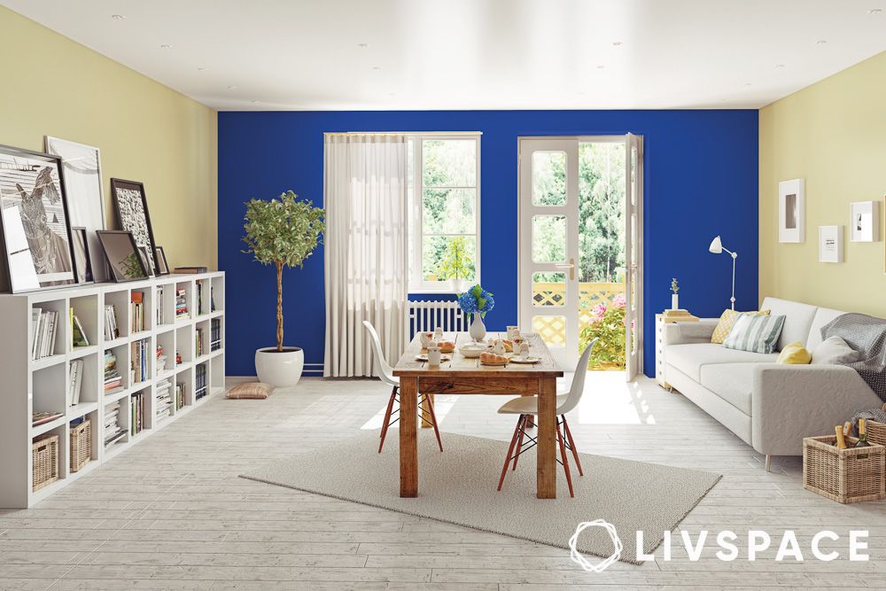
Royal blue and muted yellow are a regal pair. This interior house colour combination brings a sophisticated yet cheerful vibe to your home. It’s perfect for a living room or a bedroom where you want to feel both relaxed and inspired.
#12: Lilac and pastel orange
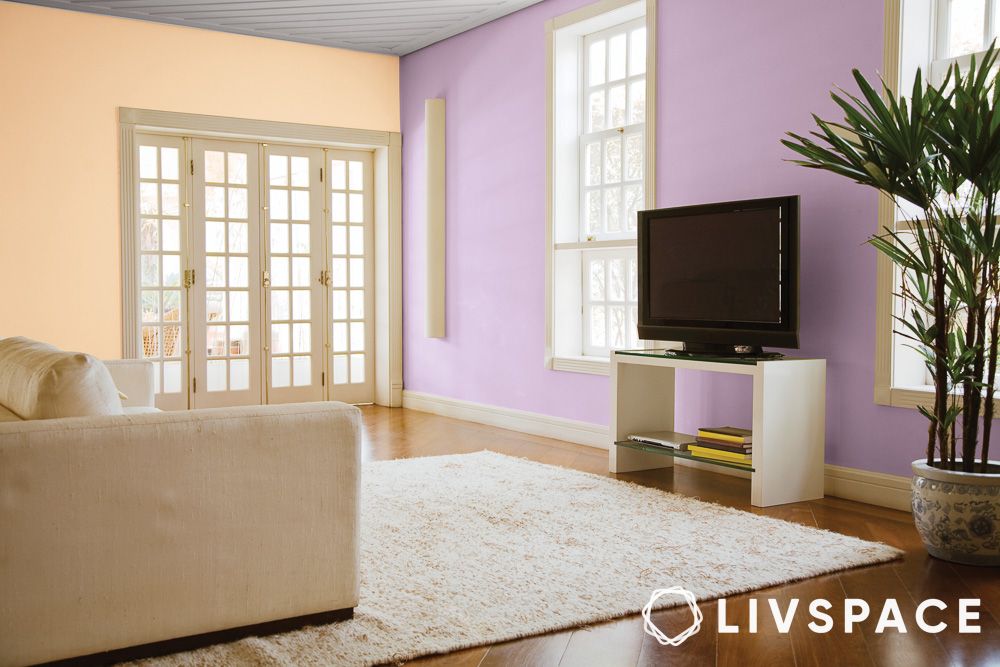
If you fancy a bit of pastel in your space, go for a mix of lilac and pastel orange. This unexpected interior house colour combination adds a funky, modern touch to your home. Use it in spaces where you want to express your creativity and individuality, like the living room or the home office.
#13: Sage green and turquoise
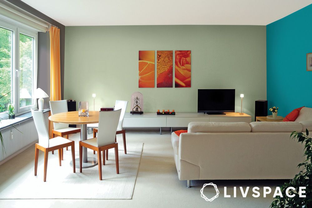
Sage green and turquoise are a refreshing duo. This combination brings a natural, serene vibe to your home. Perfect for creating a calming atmosphere in any room, it makes you feel like you’re surrounded by nature.
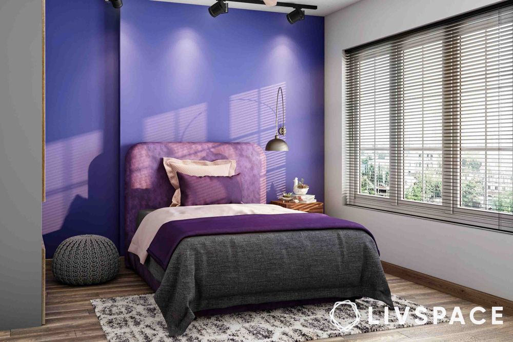
#14: Dark purple and white
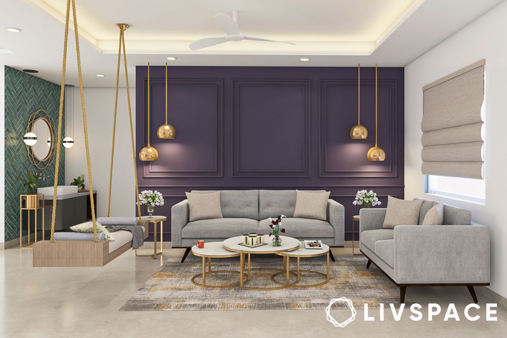
Dark purple and white are elegant and dramatic. This combination adds a touch of luxury to your space. Use it in a bedroom or a living room where you want to create a rich, inviting environment.
#15: Russet brown and white
The combination of russet brown and white is warm and welcoming. It is perfect for creating a cosy, inviting space. Use it in rooms where you want to feel relaxed and at home, like a living room or a study.
#16: Sky blue, livid grey and white
Sky blue, livid grey and white bring a touch of the heavens to your home. This combination is perfect for creating a calm, peaceful atmosphere. Use such sky blue two colour combination for bedroom walls to help channel your child’s energy.
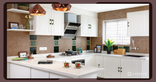
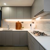
#17: Lilac, white and off white
How dreamy is this kitchen dressed in shades of lilac, white and off-white? This combination is perfect for creating a light, airy space. Use it in the kitchen, bedrooms and living rooms where you want to feel calm and relaxed.
#18: Lime green, yellow and white
Lime green, yellow and white are fresh and lively. This combination is perfect for spaces where you want to feel energised and happy, like a kitchen or a playroom. It is also a great choice for a dining area where your guests feel the energy of the room.
#19: Yellow, white and blue
Yellow, white and blue are cheerful and inviting. This combination is perfect for creating a bright, happy space. Use it in kids’ rooms, kitchens, living rooms and bathrooms for a fresh, welcoming feel.
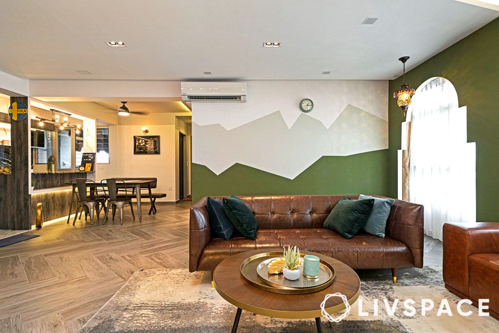
#20: Forest green and white
Forest green and white brings the beauty of nature indoors. This combination is perfect for creating a calm, serene space. Use it in any room where you want to feel connected to the outdoors.
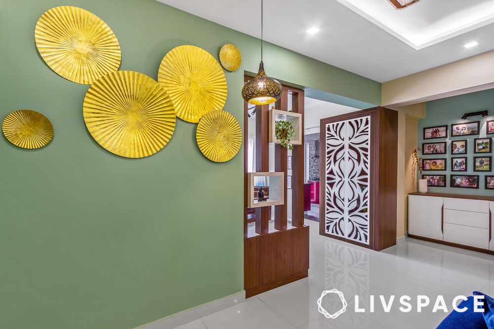
#21: Grey, green and white
Nature-inspired paint colours for walls, such as soft sage and muted olive, along with calming greys reminiscent of stone and whites as airy as clouds, create an organic feel in your space. These colours adapt beautifully to different lighting, offering versatility and allowing you to customize your room’s atmosphere.
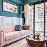
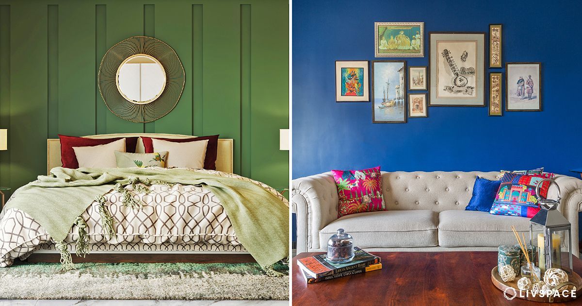
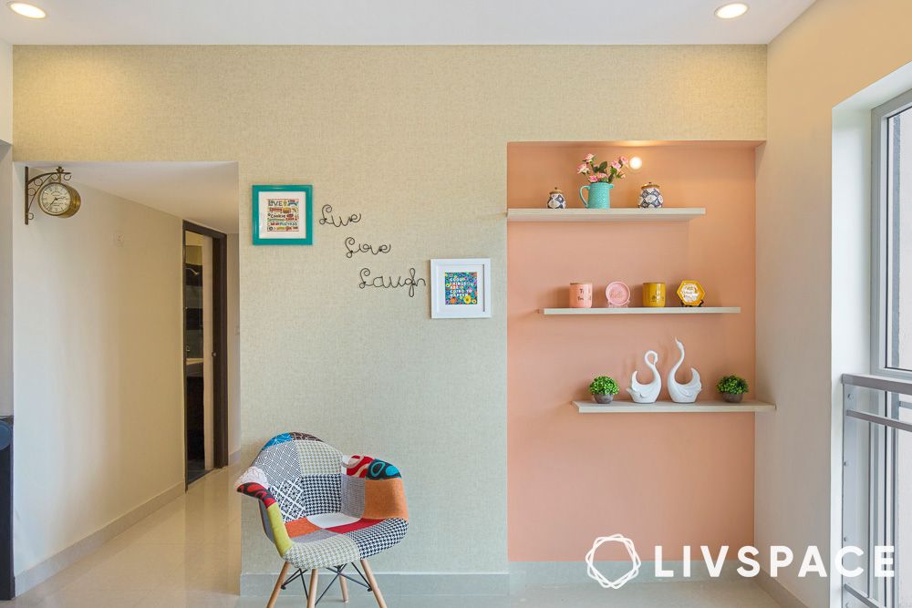
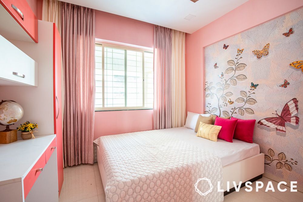
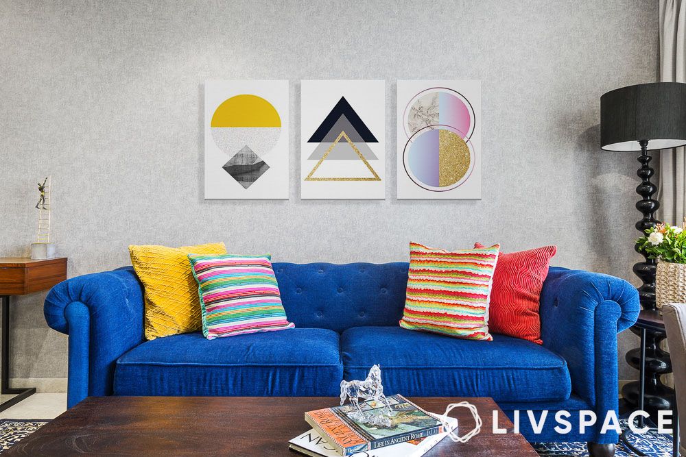
#22: Pinks and grey pastels
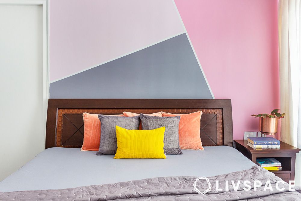
The soft pink and grey pastel interior house colours in the picture create a soothing vibe and the stylish colour blocking is a visual charm on your walls. Whether you are going for a modern, minimalist feel or a fun look, these colours can be your go-to choice.
#23: Mash of blue and yellow
Blue and yellow are like BFFs on the colour wheel, totally complementing each other. Whether it’s light blue rocking with yellow and pink, or royal blue slaying with red, white and a hint of yellow, this interior house colours game is strong!
#24: Teal and cream
When it comes to decorating with neutral tones like cream, teal makes a cool and easy companion. It’s a bold colour on its own, but teaming it up with cream gives a subtle and stylish pop of home interior colour—perfect for those who want to add a touch of vibrancy to their home without going over the top.
#25: Yellow, brown and white
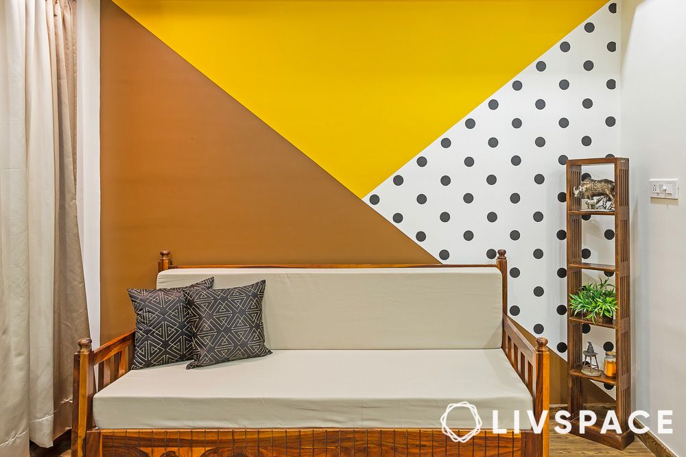
Yellow and brown make a perfect fall combo, like the hues of autumn leaves and Thanksgiving decor. If your room has cosy tones of tan, taupe and medium brown, cheerful yellow accents fit right in. Throw in a few polka dots to bring in a touch of whimsy.
#26: Light green and lemon yellow
This is a cheerful and refreshing colour palette for your living room, kitchen, or bedroom! The soft green brings a calming vibe, the lemon yellow adds a burst of energy and the white balances it all for a bright and airy feel. Throw in some colourful accents and you have got a perfectly tied-together room!
#27: Yellow and grey
The good news for people searching for wall paint ideas is that pretty much all kinds of grey can effortlessly pair with yellow. But to max out the contrast, make sure you combine dark grey hues with light yellow ones or vice versa.
#28: Orange and green
Imagine bringing nature indoors by combining earthy orange and green paint colours for walls in your home—it’s surprisingly refreshing and perfect for rooms with limited sunlight. Opting for accent walls in these hues is a fantastic way to bring these lively home painting colour combinations to life.
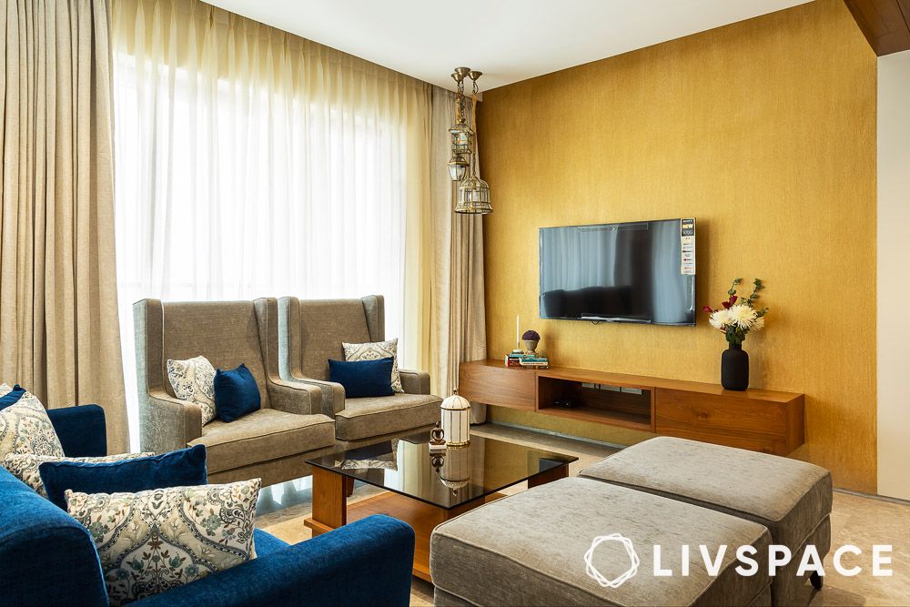
#29: Textured orange and gold
f you’re drawn to nature-inspired vibes, opt for cosy orange and gold home colour combinations on your walls to infuse warmth into your space. Textured paint adds a cool aesthetic while camouflaging any imperfections, complemented by neutral shades. Incorporate metallic accents to elevate the gold tones and add a touch of glamour.
Also Read: Colour Palette for Home: Single or Multiple Shades?
Now, let’s explore single-colour wall paints that will spruce up your home:
#30: Dark purple
Home colour combinations from a dark colour palette may not be common in Indian homes, but there are numerous ways to integrate them into your living space. A straightforward approach is to coordinate furnishings in the same hue. If you enjoy layering various shades of a single colour, exploring dark hues can be a rewarding experiment in interior house colours.
#31: Dark blue
Among the list of paint colours for walls, dark blue tops the charts in many Indian homes. Since it is a dark colour, avoid painting all four walls with the same colours as it can darken the room. So whether you are a fan of maximalist style interior design or traditional Indian interior design style, this colour will work for you. Finally, finish the look with some wall art and you are good to go!
#32: Red
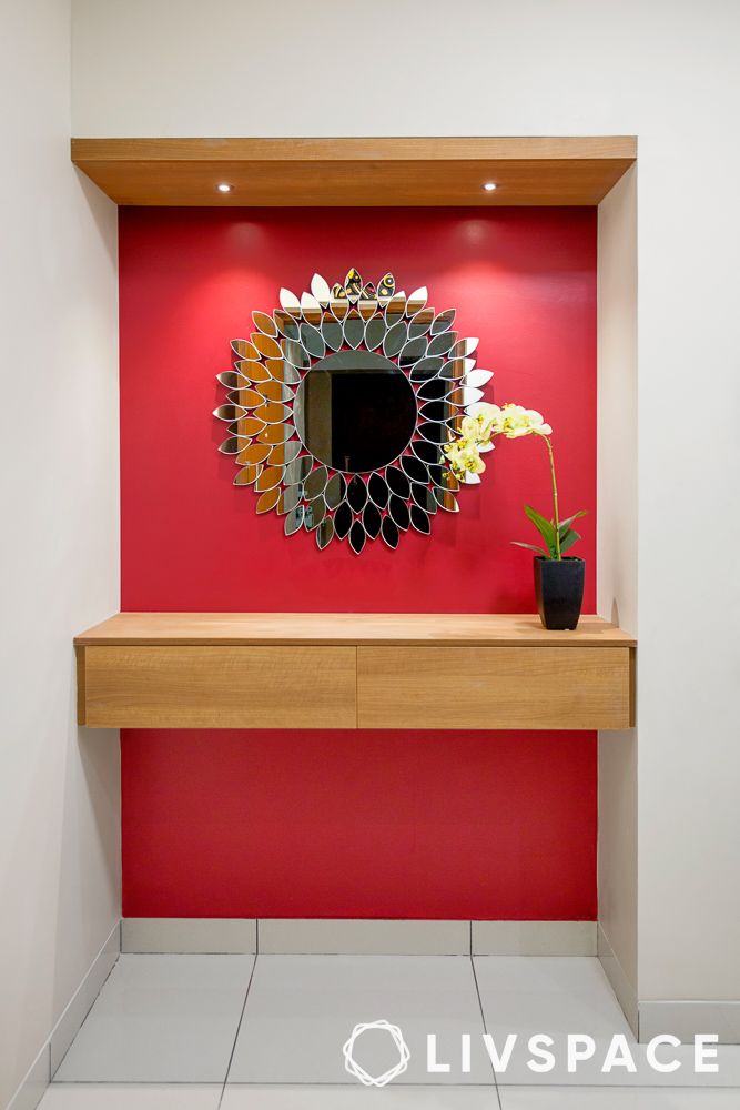
Although the colour is often synonymous with fast food chains to help stimulate hunger, it can work just as well in a home colour combination. However, when choosing paint colour for walls inside your home, avoid using bright red in bedrooms. This is because red is a stimulant that does not pair well in places that are meant for rest.
Instead, use it as a home colour inside your living room. House painting colours inside your living room can be energetic and eye-catching, as this space is used recreationally.
#33: Textured emerald green
If you are after a dramatic effect or a maximalist look, textured emerald green is the colour for you. This interior house colour adds depth and richness to your space. This bold colour is perfect for creating a dramatic, luxurious feel. Use it as an accent wall or in furniture pieces to make a statement.
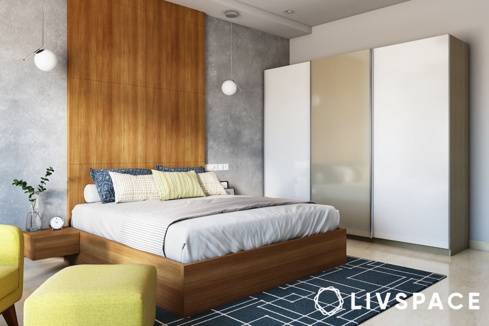
#34: Light blue
In line with calming pastel colours, light blue blesses the list of home colour combination ideas. Being a tranquil shade, it’s best suited for spaces you want to unwind in. As a house interior colour option, it can help open up the space and make it feel more spacious than it really is.
Also Read: 20 Great Bedroom Colours That Work for All Room Sizes
#35: Light purple
If dark purple paint colour for walls isn’t to your liking, why not go a shade lighter? Take a cue from the way this home makes use of its house painting colours. Instead of playing it safe with a basic feature wall in a solid colour, it uses metallic paint.
The glimmer and sheen from the metallic paint transform the light purple, making it a must-have house painting colour. You can either leave this as the statement piece in your room or add more drama to the space with accent furniture.
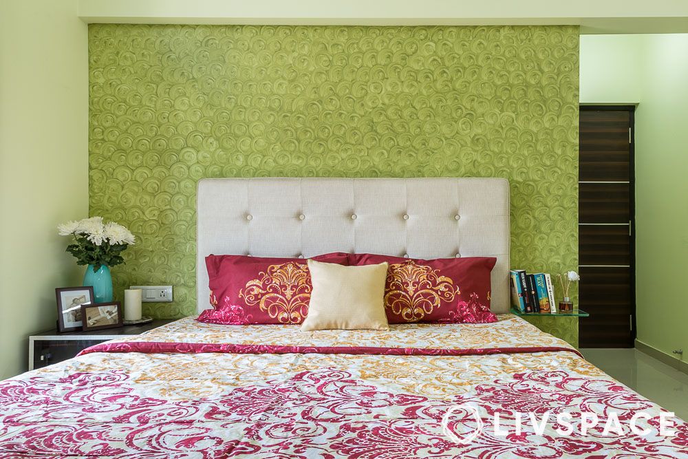
#36: Greenish-yellow
Who doesn’t love a hint of greenery for home colour combinations? Green has a nurturing element in it that makes your home feel like a safe and peaceful haven. When paired with a tinge of yellow, you get a taste of both nature and sunlight in one shade.
To jazz up the look of greenish-yellow walls, pair it with terrazzo tile floors and tall plants like monstera or fig. Home interior colours in greenish yellow look best with a rustic finish. Rattan cane or woven furniture can further amplify the style.
#37: Bright yellow
If you live in a home that does not receive a lot of sunlight, chances are you could use some brightness. A good way to incorporate it is by incorporating it into your home colour combination. With a nice shade of bright yellow for your home interior colour, you are sure to form a sunny disposition, too! Pair it with traditional wooden furniture or colour-blocked palettes for best results.
#38: Mustard
Mustard might not be everyone’s first choice for paint colour for walls. Much like the condiment, mustard as a colour packs quite a punch and can be overpowering—if not paired correctly.
If you choose mustard as a interior house colour, let it stand as a statement piece. Adding too many other colours can overwhelm the space and make it look congested. Instead, introduce contrasting furniture and accent pieces to create a striking colour combination.
#39: Orange
Similar to yellow and mustard, orange is one colour that can lend warmth to a space. It’s also a common paint colour for walls in mid-century modern and contemporary homes.
You can make it work with rustic decor using a darker shade of orange. Be sure to use darker shades in social areas as it has an invigorating effect, perfect for entertainment spaces. Similarly, lighter shades can be used in the bedroom or other private areas for a more rejuvenating feel.
#40: Pastel blue
If you prefer the look and convenience of neutral shades but still want some element of colour, pastel blue for interiror house colour is the choice for you. Pastel blue is a great paint colour option for walls when it comes to softening your home colour combination. You can easily use it as a background to draw more focus on statement furniture or accent pieces. Moreover, it won’t overpower the other colour palettes in your home, unlike stronger shades of blue.
#41: Grey
Grey is probably one of the most misunderstood paint type and colour for walls out there when it comes to selecting a house colour combination. Owing to its cold tones and dreary appearance, we are often deterred from using it in our interiors. Now’s the time to break these stereotypes, as grey can be just as inviting and chic as other colours as an option for either an interior house colour or even as an option for paint colour for walls.
With grey, you can either choose warm or cool-toned greys depending on the look you are going for. You can highlight this colour with bright, contrasting decor items to strengthen the design.
#42: Magenta
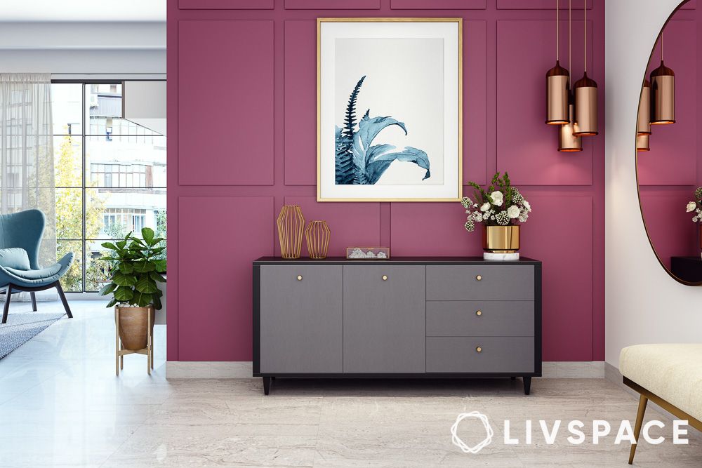
Looking for a bold, dramatic house colour combination to spice up your walls? If yes, you don’t want to overlook magenta as an option for home interior colour. With a flair for elegance, this enchanting shade can take your interiors from plain to chic in seconds. Use plants and greenery along with brass accents to balance it out.
#43: Crimson
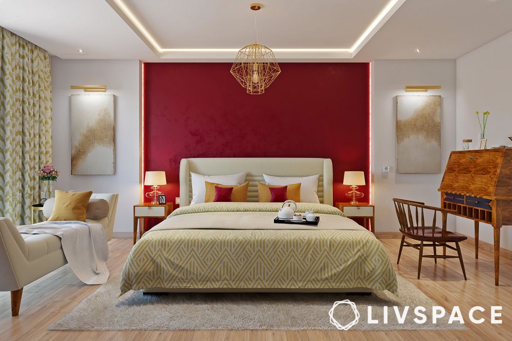
Did you know that certain colours can help create the illusion of depth in your room? Crimson and white as a house colour combination achieve just that. If you have an entirely neutral room, consider adding depth with a crimson feature wall.
Here, the crimson feature wall frames the bed and elongates the room. This visual illusion helps make smaller spaces appear bigger than they are.
#44: Avocado green
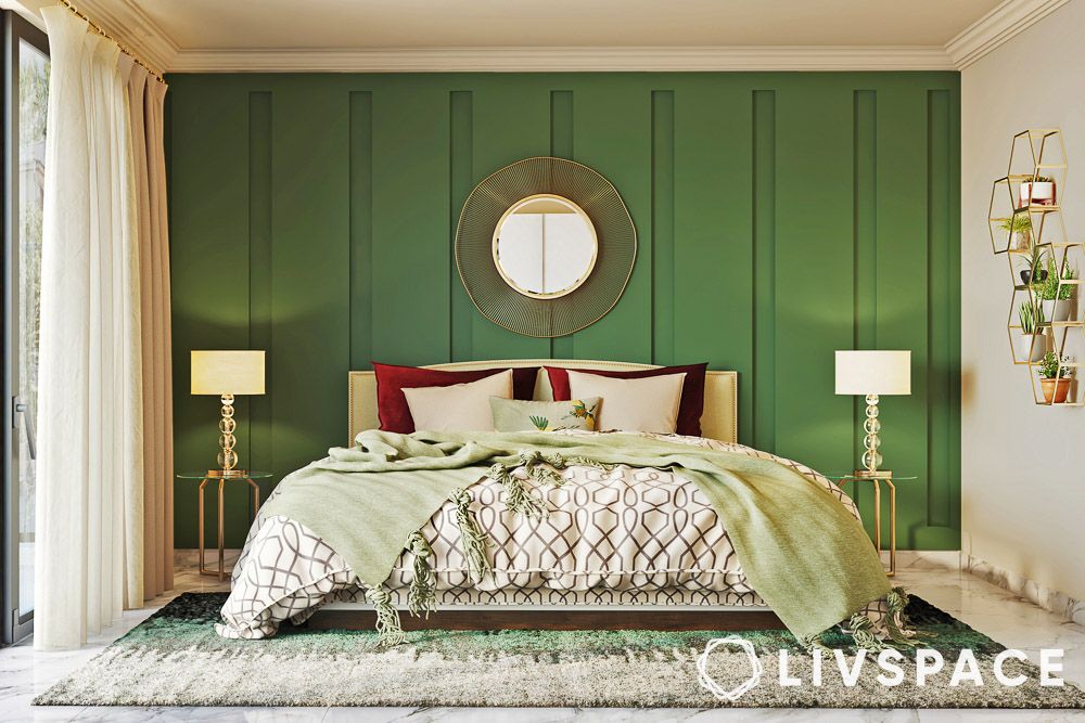
Avocado green is a muted green shade that pairs well with other shades of green. To further accentuate the colour, play with gold and brass accents to create a jewel-toned theme. Also, be sure to light up your space with ambient and task lighting if you are using this colour.
Now that you know what house colour combination styles to try out, you can also look at the cost of painting your home per sq. ft.
#45: Pristine white
Bright white walls can open up a room, perfect for small or dim spaces. Plus, white walls let you switch up your decor hassle-free, giving your home a clean and inviting vibe. Just think about other colours for areas with lots of activity, especially if you have kids or pets.
#46: Cream
Cream may seem neutral but your room’s vibe can change based on the tones you go for. If you want a warm and cosy feel in your modern space, go for a true cream with deep yellow undertones. For an elegant touch and chill vibes, pair creamy beiges with earthy shades. Therefore, cream is a versatile option for interior house colours.
#47: Peach cream
Think of peach as the millennial pink – when mixed with cream, it adds a serene feel to your walls. Blend it with whites, beiges or greys and throw in pops of turquoise, navy blue or sage green for a stylish touch. Keep in mind, though, that peach for home interior colours can be a bit high-maintenance, especially if you have kids or pets, so consider stain-resistant options for a worry-free wall.
#48: Textured gold
Painting your walls with textured gold paint not only hides flaws like cracks and dents but also adds a touch of brightness with a lighter shade or a dash of drama with a darker hue. However, remember that the textured finish might snag some dirt along the way.
#49: Rustic sky blue
Paired with creamy and sandy hues, rustic sky blue is simple, understated and elegant. It’s a classic choice for a living room colour scheme that works year-round — just add rich chocolate-brown pillows and a caramel-coloured throw in the mix. It pairs well with a wide range of home interior colours, including white, grey, beige and natural wood tones.
#50: Powder blue
Powder blue originated from powdered smalt in the 1650s, later becoming a colour name in 1894. This divine, pale shade works wonders with accent colours like white, grey, yellow and pink but if you want to avoid a flat look, add texture with rugs, curtains or throw pillows and consider using it as an accent or mixing it up with other colours in a large room.
#51: Dark burgundy
Forget the ’90s nostalgia—burgundy isn’t just for outdated wall designs. As a home interior colour, it is versatile and can enhance any season, whether it’s on walls, paired with complementary hues, or featured in art and furniture. Once a symbol of power and wealth, dark burgundy walls require the right lighting—opt for natural light and add artificial illumination if needed.
#52: Light turquoise
A light turquoise shade does more than provide a cool backdrop; it enhances your furniture and decorations, infusing your space with an airy vibe. This calm and inviting wall colour blends the tranquillity of blue, the growth of green, and the energy of yellow, making it a perfect match for light furniture. Ideal for achieving chic Japandi-inspired minimalism in your home, turquoise brings a serene and stylish atmosphere.
#53: Midnight blue
Midnight blue, a deep and nearly black shade of blue, is one of the darkest blues available. Pair it with warm tones like wood or gold to create a cosy vibe, but use it sparingly in dark rooms to avoid making the space feel even darker. To brighten the area, incorporate lighter shades or enhance the lighting.
#54: Cerise pink
Cerise, a rich reddish-pink shade, pairs well with fuchsia and rose red. To balance its vibrancy, mix in neutral tones like white, beige or grey for a soothing vibe. Add pops of contrast with complementary colours like green or blue to create a warm, inviting atmosphere associated with happiness and passion.
#55: Peach bud
Opt for peach bud paint colour for walls in your bedrooms and bathrooms to set a calming vibe—it goes perfectly with white, beige, grey or brown. Add dark furniture for balance, or go for a timeless feel by pairing peach with cream or off-white, creating a spacious atmosphere.
#56: Sage green
The best way to soften a room is to use a tranquil shade of green: sage. Identified by its greyish, silvery undertones, sage is a welcome twist on traditional greens that sit well alongside neutrals like taupe, cream and beige.
#57: Textured green
Painting your room in calming green tones, whether it’s a soft sage or rich emerald, creates a peaceful and relaxing atmosphere, like being in a tranquil outdoor retreat. Opt for eco-friendly textured paints with low VOCs for a nurturing space, especially important in places like bedrooms.
#58: Baby pink
Baby pinks bring peaceful, tranquil vibes, making them perfect for bedrooms, bathrooms or nurseries. Pair it with neutral tones like white, beige or grey for a grounded look, or throw in some pops of contrast with colours like blue or green.
#59: Coffee brown
Coffee brown is a neutral earthy hue that effortlessly complements various colours and designs. Whether you want it as a subtle backdrop letting your art and furniture shine, or as a standout accent wall – it works both ways. Pair it with lighter tones for furniture and add pops of colour with plants or flowers. You can even add a textured rug to break up the monotony of the floor.
#60: Cement grey
Grey is a classic colour that works well in any room. Light greys bring a touch of elegance, while dark ones add some drama. Just keep in mind that if you use warm-toned lights, your cement grey walls might pick up a hint of yellow or beige.
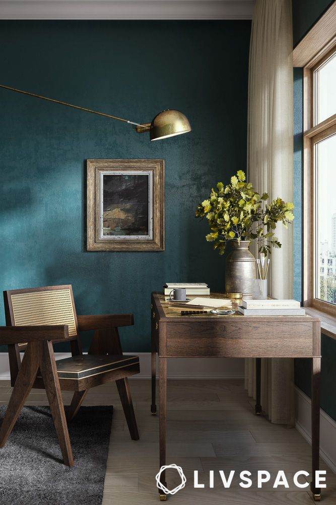
#61: Teal
Teal is like that cool friend who always knows how to stand out without even trying. This versatile colour brings a calm yet vibrant vibe to any room. Pair teal with white or light grey for a fresh, breezy feel, or with darker shades like navy or charcoal for a more dramatic effect.
How can Livspace help you?
When it comes to designing your home, colours play an important role. We hope you found these house colour ideas useful! If you want beautiful interiors for your home, then look no further. Book an online consultation with Livspace today.
- Our team can custom design your dream home with curated render designs and expert advice
- We have delivered over 75,000 happy homes
- Count on us for premium-grade materials that are not only high-quality but also built to last
Wondering how our customers feel about working with us? Check out the Livspace reviews here!