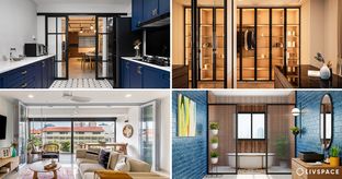
In This Article
- #1: Following trends blindly while choosing a colour combination for home
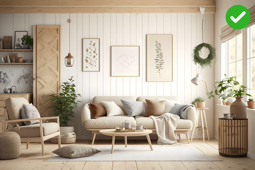
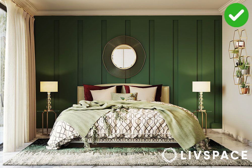
- #2: Playing too matchy-matchy is a common room colour mistake
- #3: Using wild colour combination for home
- #4: Using tiny paint chips to decide the right room colour combination
- #5: Not considering the ceiling as part of the room colour combination
- #6: Do not forget the 60-30-10 rule while choosing the right room colour combination
- #7: Not considering lighting is a HUGE mistake
- #8: Using the wrong finish even though you got the right room colour combination
- #9: Ignoring undertones while choosing the right room colour combination is a no-no
- #10: Not considering the mood of the room while choosing a wall colour combination
- #11: Using too much of one colour in your room colour combinations
- #12: Forgetting your furniture even though you’ve got the right room colour combination
- #13: Not considering the size of the room while choosing a wall colour combination
- #15: Ignoring the architectural details
- #16: Not testing the wall colour combinations before painting
- #17: Using too many room colour combination is a mistake too
- #18: Ignoring accents can lead to a huge room colour mistake
- #19: Ignoring the floor is a room colour combination mistake 101
- #20: Ignoring the outdoor view is another common room colour combination mistake
- How can Livspace help you?
Let’s be honest, we’ve all been there. That moment of sheer panic when you realise the paint colour you thought would be dreamy actually makes your living room colour combination look like a hospital waiting room.
Prepare to cringe, because we’re about to dive headfirst into the world of colour combination disasters. Consider this your official room colour mistakes guide to avoiding a paint-related meltdown.
#1: Following trends blindly while choosing a colour combination for home
Room colour combination trends are like fleeting fashion – hot today, forgotten tomorrow. Painting your living room ‘Pantone’s Colour of the Year’ might seem like a brilliant idea now, but imagine the horror when you’re stuck with it for years to come. Let your walls reflect your unique personality, not some fleeting Instagram trend. After all, your home should be a reflection of YOU, not a replica of someone else’s Pinterest board.
Pro tip: Choose a neutral base for your walls (like a warm grey or off-white). Then, introduce the trendy colour (say, Mocha Mousse – the Pantone Colour of 2025) through accessories. This way, you can easily change the “trend” without repainting your entire room when the next big colour hits.
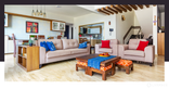
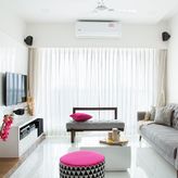
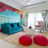
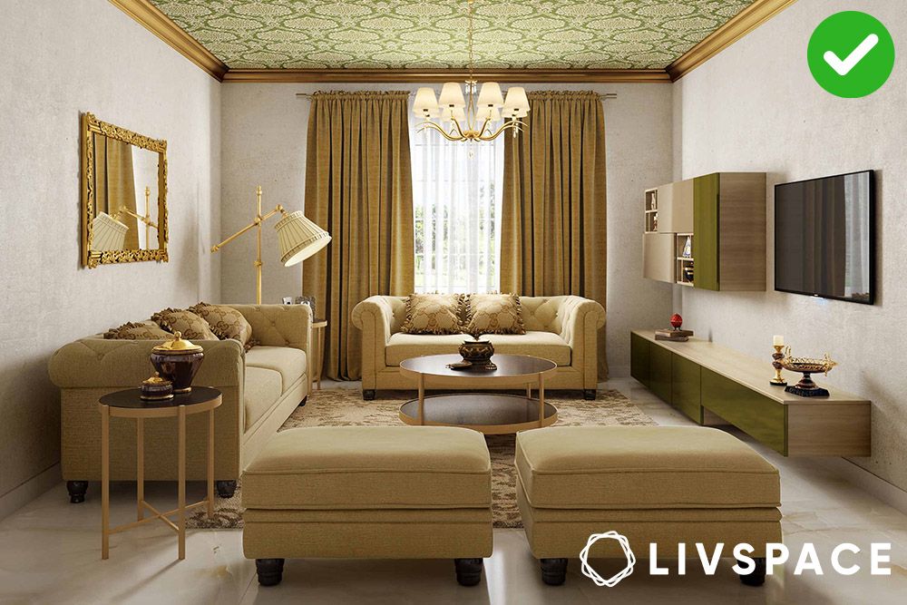
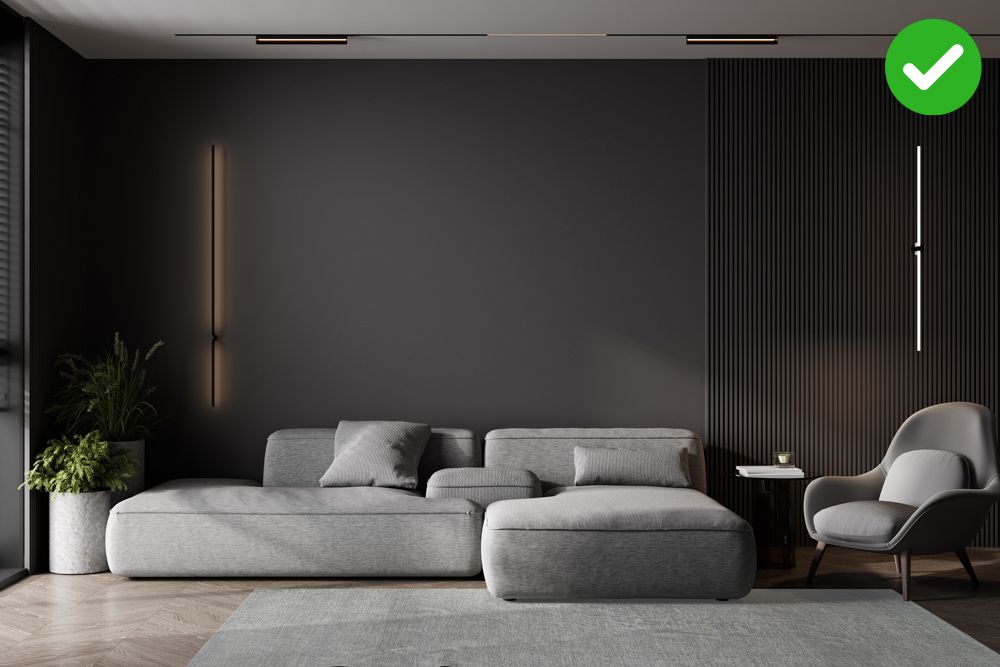
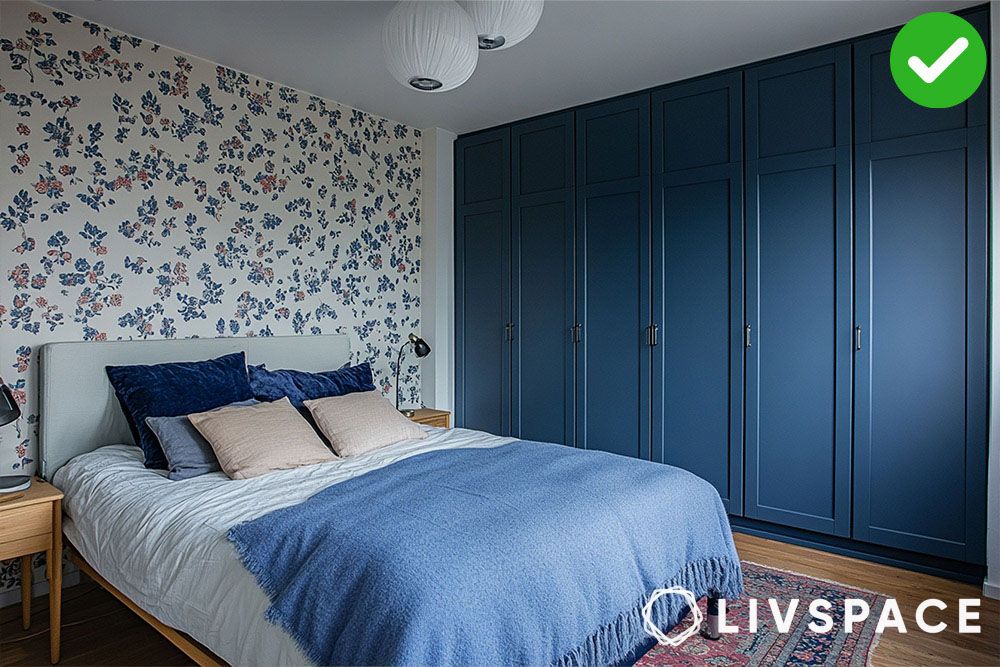
#2: Playing too matchy-matchy is a common room colour mistake
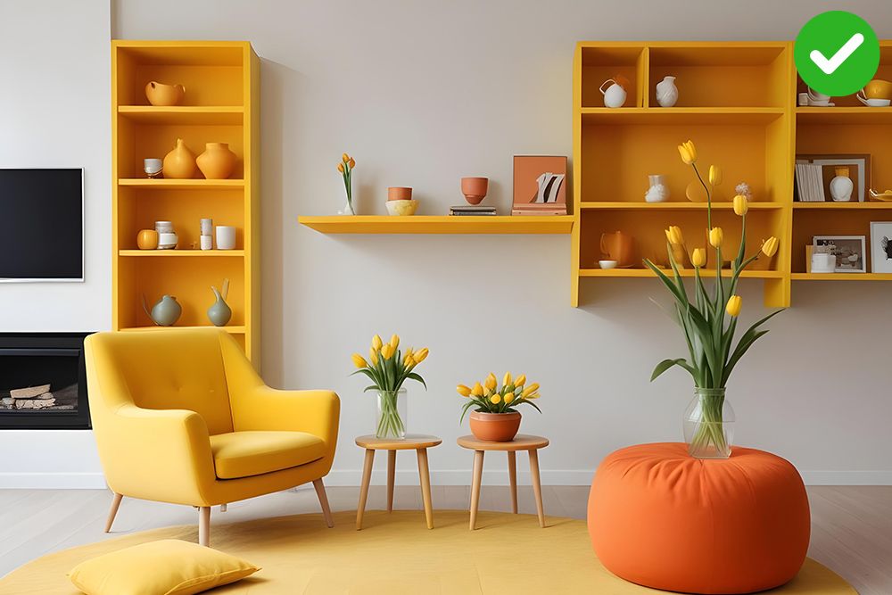
We know it’s tempting to keep things simple and match all your accessories and furnishings to your walls, but wait! Matching room colour combinations? Please, don’t be such a matchy-matchy! It’s like forcing your socks to wear the same shoes – boring, predictable, and frankly, a bit suffocating.
Throw a vibrant rug on a neutral floor or opt for a more greyed out version of the dominant colour if you still want to match things. TBH, who wants to live in a room that looks like it was designed by a colour-coordinated robot?
Pro tip: Yes, it’s good to match things around home, but do not go overboard. Play around complementing colours (as on the right)!
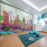
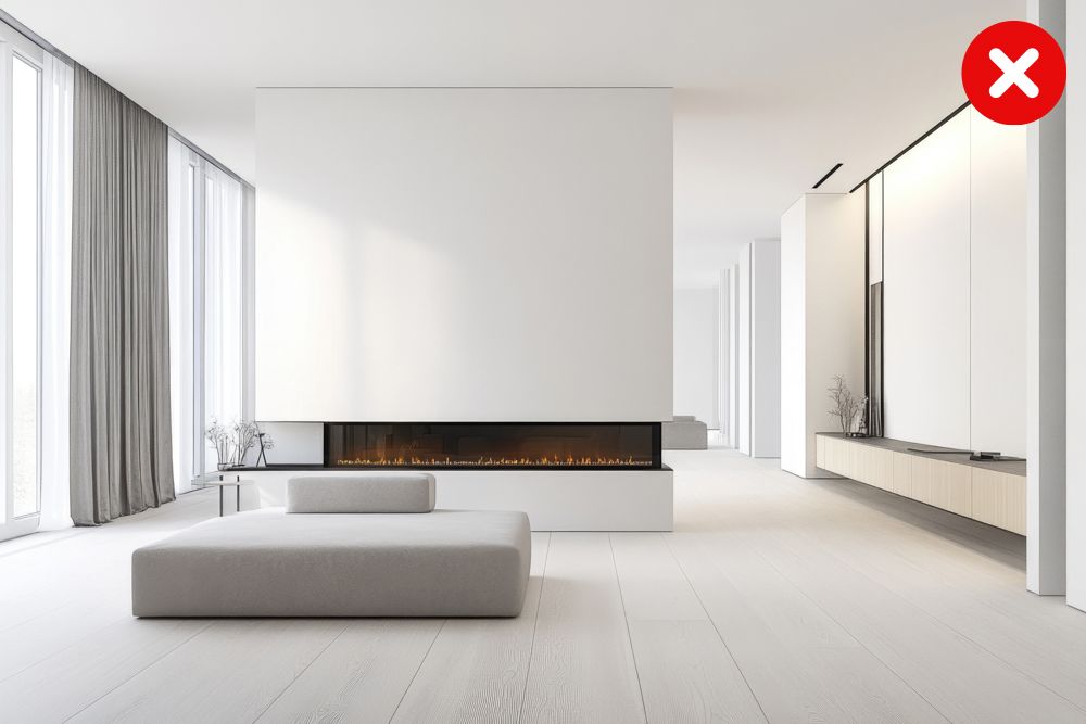
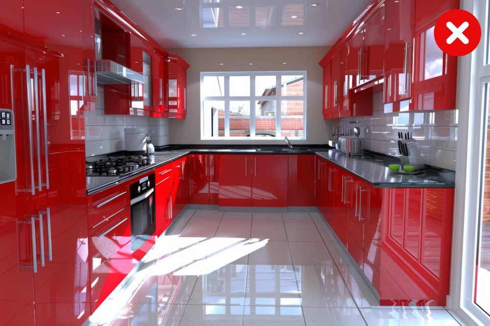
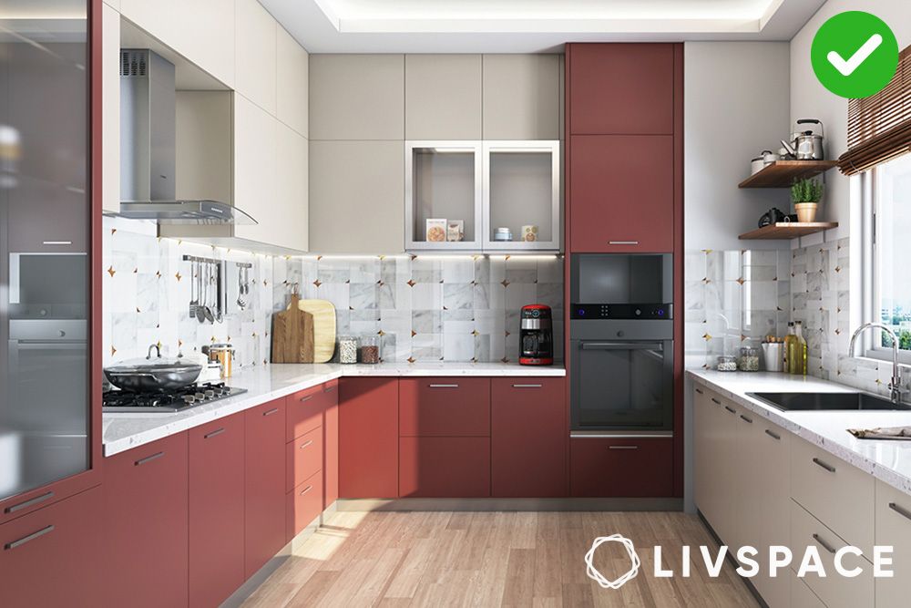
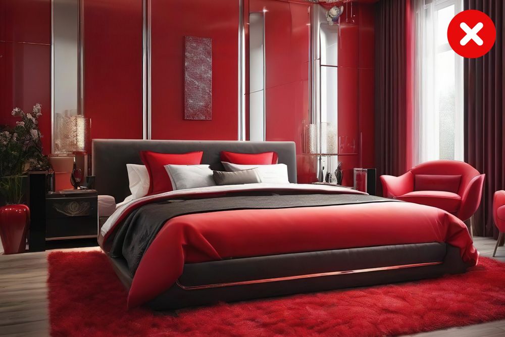
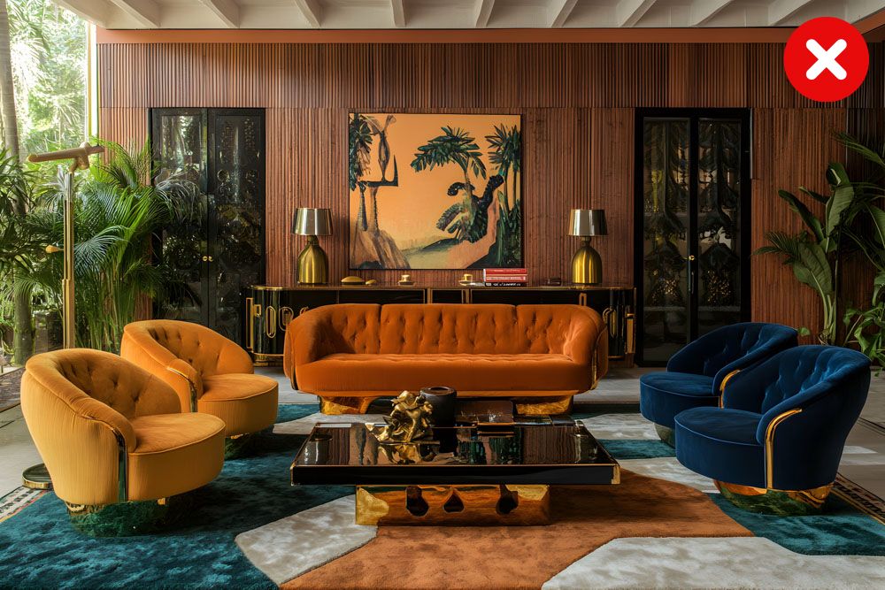
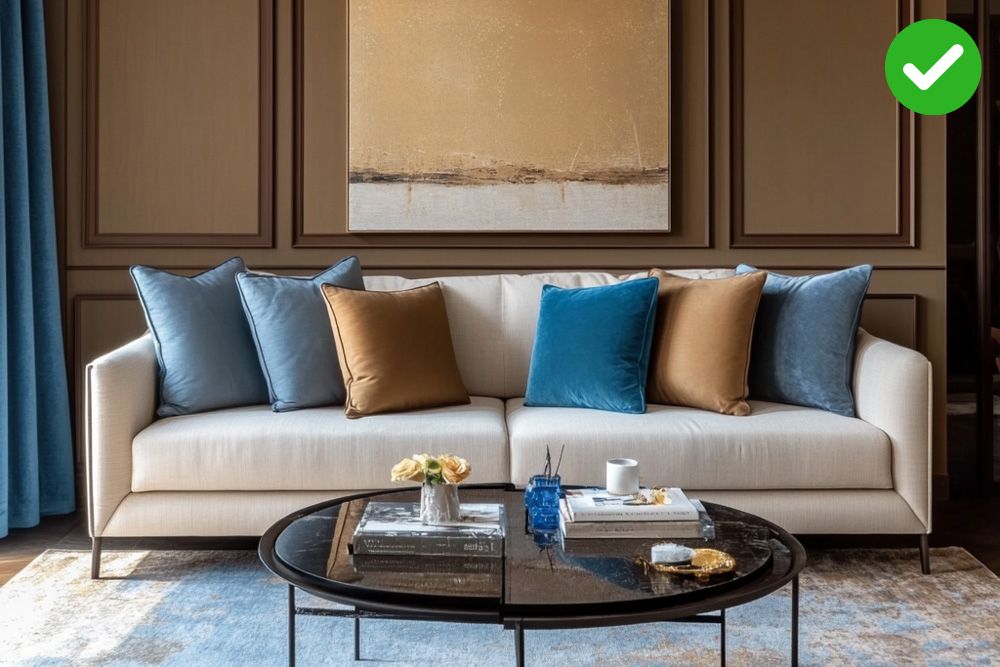
#3: Using wild colour combination for home
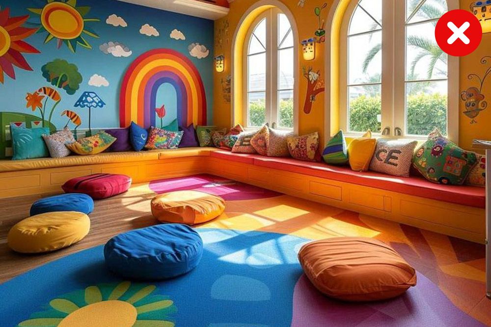
One thing that most of us are vulnerable to, is overdoing colours. Yes, it’s true, that if your personality is such that you love loud colours, then you might end up making your home look like a clown. We’re sorry! Resist using all the colours from the rainbow in one room or even one home, for that matter.
Pro tip: Go wild if that’s your thing, but avoid room colour mistakes by keeping the look minimal (as on the right).
#4: Using tiny paint chips to decide the right room colour combination
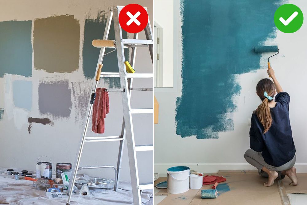
Image credits: Pinterest @family_handyman
Forget those itty-bitty paint chips! They’re about as helpful as a thimble in a boxing match. Seriously, how are you supposed to get a real sense of colour when it’s squished onto a piece of paper the size of a postage stamp?
Such interior house colours can make a bold hue look timid and a subtle shade appear garish. So, ditch the chips and embrace the grandeur of proper paint samples. Paint large swatches on your walls, and observe them in different lighting conditions.
Pro tip: Tiny paint strips won’t work for the bigger picture. Think about testing colours as a big patch, instead.
#5: Not considering the ceiling as part of the room colour combination
Ignoring the ceiling design in your colour scheme is like forgetting to wear socks – technically, you can get away with it, but it just feels… wrong. A drab white ceiling can make a room feel flat and lifeless, like a sad pancake. But fear not! A touch of colour or a unique texture can transform your ceiling into a statement piece.
Pro tip: If you’re feeling adventurous, try painting your ceiling a shade or two lighter than your walls for a subtle yet sophisticated look.
Also Read: 50+ Unique POP Ceiling Designs That Will Leave You Inspired
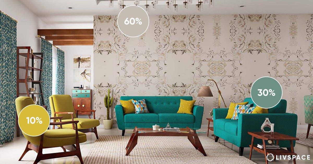
#6: Do not forget the 60-30-10 rule while choosing the right room colour combination
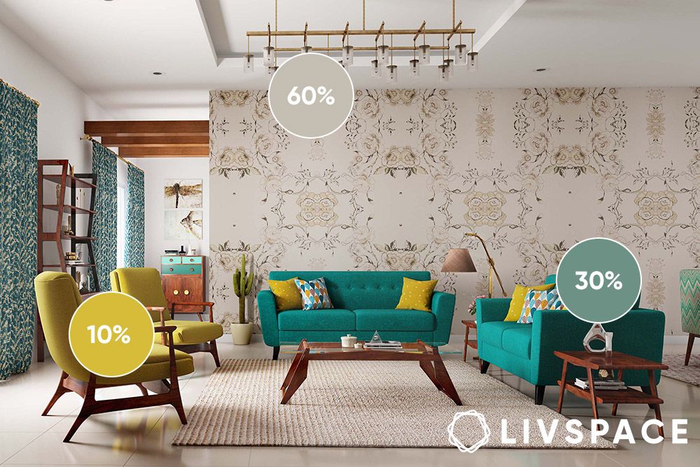
It’s like a secret designer code that ensures your room doesn’t turn into a chaotic circus of clashing hues. 60% of your dominant colour (think calming neutrals or that bold hue you can’t live without) sets the mood. 30% is your supporting actor, adding depth and personality. And 10%? That’s your scene-stealer, your accent colour, bringing the drama!
Pro tip: Don’t be afraid to play with undertones! A cool grey 60% can be paired with a warm wood 30% and a vibrant teal 10% for an unexpected and stylish twist.
#7: Not considering lighting is a HUGE mistake
Colours shift dramatically depending on the type of lighting design: warm, cool, natural, artificial. Some colours will look just as you imagined in bright sunlight, but the moment you see them under artificial or dull lights, they lose all their appeal. Before plunging into a colour, make sure you do a swatch test on the part of the wall and see if you like it. Lighting is very essential when it comes to deciding the right colour combination for your interiors.
Pro tip: Test your paint samples throughout the day and evening, under different lighting conditions. You’ll be amazed at how the colours transform, and you can avoid any major colour catastrophes.
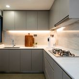
#8: Using the wrong finish even though you got the right room colour combination
Glossy finishes are fabulous for high-traffic areas like kitchen colour combinations and bathrooms, easy to wipe clean and resistant to those inevitable scuffs. Matte finishes, on the other hand, are perfect for hiding imperfections and creating a sophisticated look in living rooms and bedrooms. So, choose your finishes wisely, my friend, and save yourself a whole lot of scrubbing!
Always consider the sheen of your paint while choosing your interior colour combination. Eggshell or satin finishes reflect light better, making colours pop and adding a subtle sheen that elevates the look. Think of it as giving your paint job a little personality – a touch of sparkle, a hint of sophistication. Now, go forth and paint with confidence (and the right finish, of course!).
Pro tip: Always test your chosen finish on a small, inconspicuous area of the wall before committing to the entire room. This will give you a realistic idea of how the finish will look and feel in the actual lighting conditions.
#9: Ignoring undertones while choosing the right room colour combination is a no-no
Think of it this way: “beige” isn’t just beige. It’s a whole secret society with members like “warm beige,” “cool beige,” “pinkish beige,” and “greenish beige” all whispering sweet nothings to your walls. If you don’t know the undertones, you could end up with an interior colour combination that looks muddy, sickly, or just plain wrong.
Pro tip: Bring home paint samples and observe them throughout the day in different lighting conditions. You’ll be amazed at how undertones can shift from warm to cool depending on the time of day and the angle of the sun.
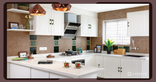
#10: Not considering the mood of the room while choosing a wall colour combination
A vibrant red might be perfect for a lively kitchen colour combination, but it’s going to give you nightmares as bed room colour combination. Similarly, a soothing blue might be great for a relaxing bathroom, but it could make your home office feel like you’re drowning in melancholy. Before you even think about paint swatches, ask yourself how you want to feel in that room. Energised? Relaxed? Creative? Then, choose an interior colour combination that evokes those feelings.
Pro tip: Create a mood board with images that evoke the desired feeling – think serene beaches for a relaxing bedroom or vibrant cityscapes for a lively living room. Use these images as inspiration for your colour palette.
Also Read: 20+ Two Colour Combinations for Bedroom Walls That You Will Love
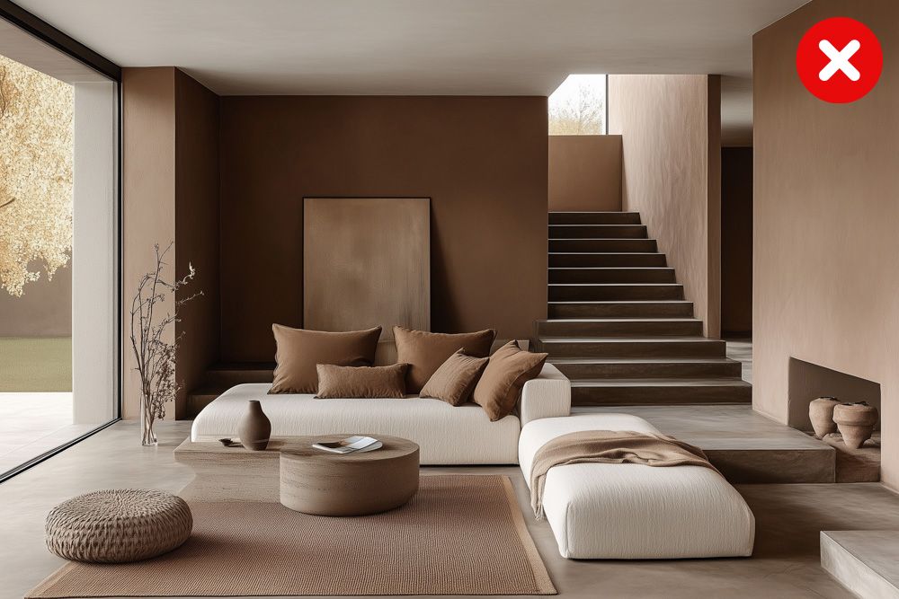
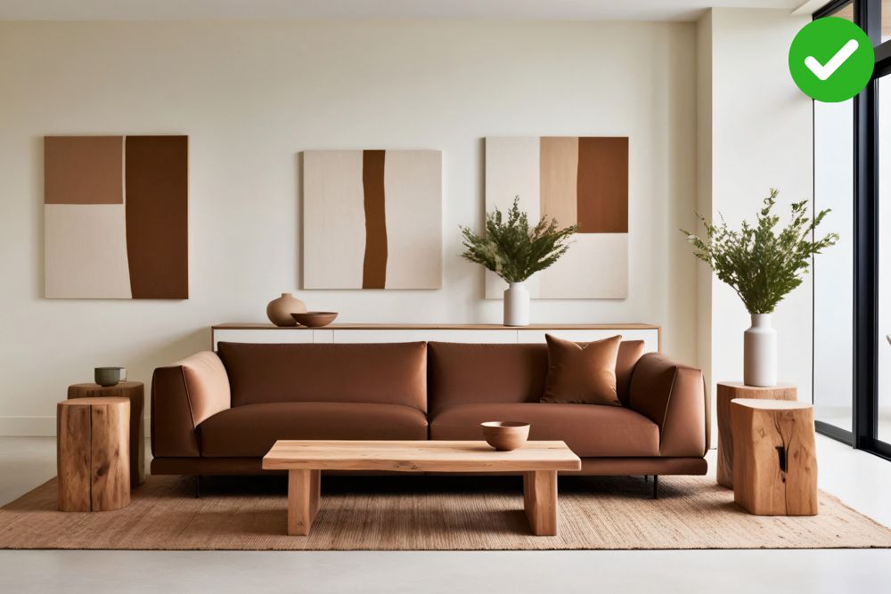
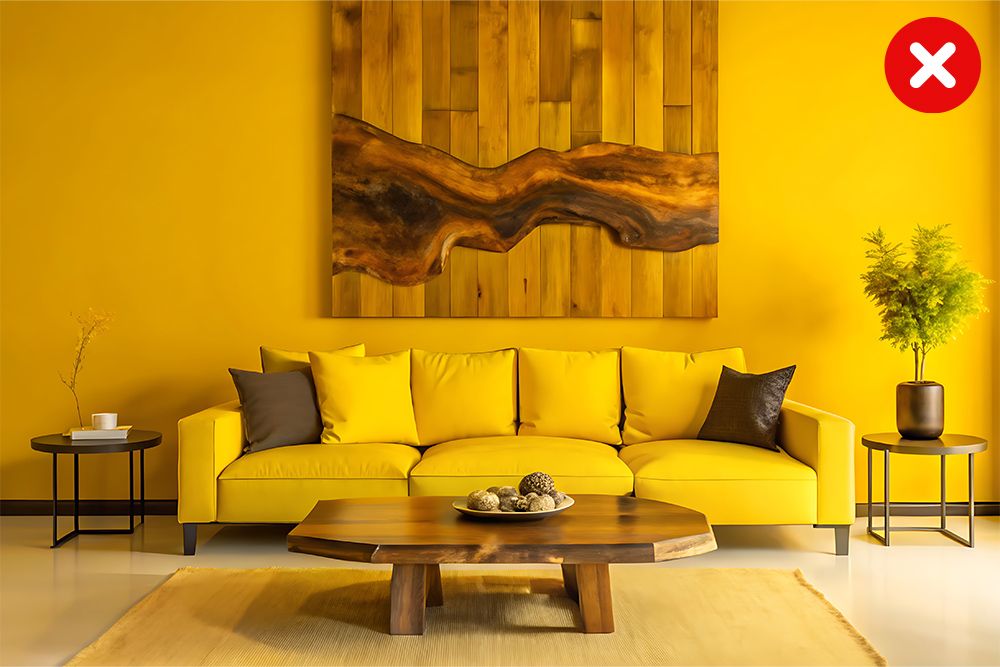
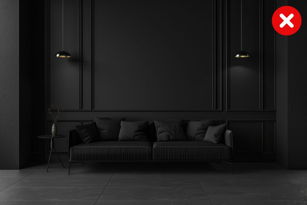
#11: Using too much of one colour in your room colour combinations
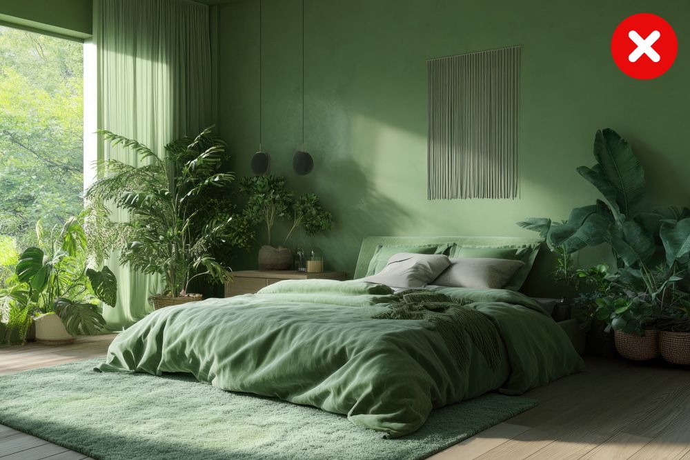
Imagine a room painted entirely in, say, crimson red. You’d probably feel like you were living inside a tomato, right? It can be overwhelming and even a bit claustrophobic. The “60-30-10 Rule” is your secret weapon against overloading the interior design colour schemes. This creates a balanced and visually interesting space that won’t give you colour fatigue.
Pro tip: Even if you’re using a lot of one colour, you can add visual interest by incorporating different textures. Think plush rugs, woven baskets, and textured wallpaper.
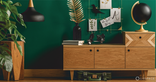
#12: Forgetting your furniture even though you’ve got the right room colour combination
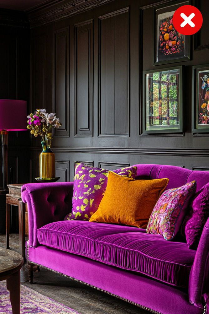
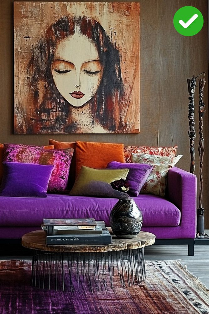
Image generated using AI
Choosing a vibrant teal wall only to realise your beloved beige sofa now looks like it’s having a major identity crisis is an interior design colour scheme disaster waiting to happen. Remember “THE THREE COLOURS” rule: a dominant colour (walls), a secondary colour (furniture), and an accent colour (art, rugs, pillows). This keeps things visually balanced and prevents colour chaos.
Pro tip: Use the colour wheel as your guide! Complementary colours (opposite on the wheel) create high-energy vibes, while analogous colours (next to each other) offer a more soothing feel.
#13: Not considering the size of the room while choosing a wall colour combination
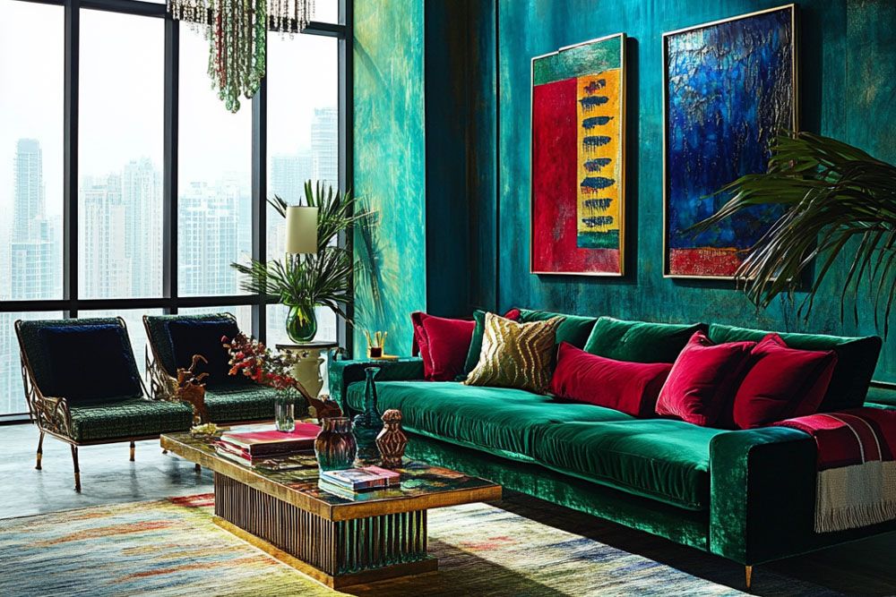
Image generated using AI
If you paint a small room a dark colour like midnight blue, it might make the room feel even smaller and a bit gloomy. On the other hand, painting a big living room bright pink could make it look like a dollhouse and feel a bit overwhelming like you’re living in a giant cotton candy cloud.
- Rich jewel tones like emerald green, sapphire blue, and ruby red can really make a statement in large rooms that get lots of natural light
- Pale hues like soft blues, greens, and greys make small rooms feel airy and spacious
Pro tip: Find that sweet spot between too much and too little. In smaller rooms, use lighter colours on the walls and add pops of deeper hues through accents like pillows, rugs, and artwork. In larger rooms, you have more freedom to experiment with bolder colours and create zones within the space.
#15: Ignoring the architectural details
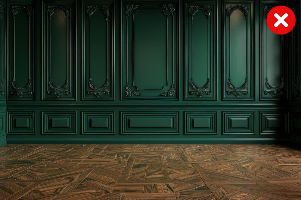
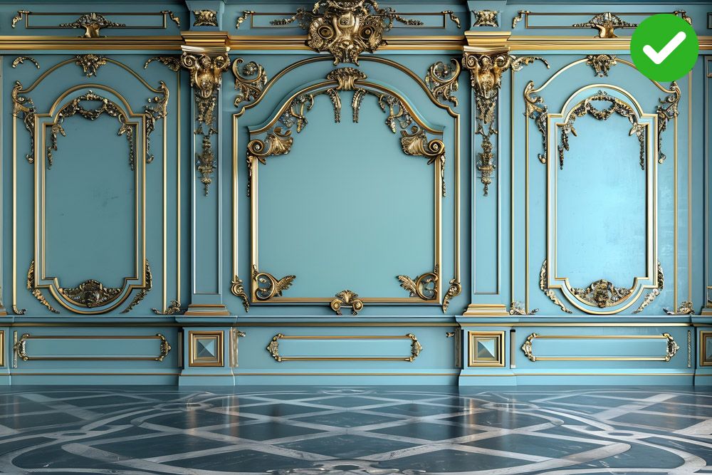
Imagine a bold, dramatic wall colour combination swallowing up delicate crown moulding – tragic!
Paint your mouldings a shade or two lighter than your walls. It’ll make them pop and add dimension to your space. For those stunning crown mouldings, consider a contrasting colour. A deep navy against a creamy white wall? Yes, please! Paint your trim a slightly darker shade than your walls. It’ll create a subtle shadow effect, making those architectural lines sing.
Pro tip: For tall ceilings or large windows, go for darker hues to ground the room or subtle gradients to emphasize height without overwhelming the space.
#16: Not testing the wall colour combinations before painting
No, colour roulette is not the right way to go! Purchase sample pots of your favourite colours and paint large swatches on the wall. This will give you a much better idea of how the colour looks in your specific lighting conditions. Don’t just glance at the swatches during the day. Observe them in the morning, afternoon, and evening to see how they change with the light. Scroll up to read more about this!
#17: Using too many room colour combination is a mistake too
Colour psychology tells us that our brains crave order and harmony. When bombarded with a rainbow of hues, our poor minds get sensory overload, leading to anxiety and a general feeling of “nope, I wanna leave.” Follow the “Three Colour Rule” and the 60-30-10 concept to avoid creating an overwhelming room.
Pro tip: Choose a colour palette that tells a story. Maybe it’s a serene beach vibe with blues, greens, and sandy neutrals. Or perhaps a vibrant urban jungle with pops of emerald green and sunshine yellow. A cohesive story keeps the colours from feeling random.
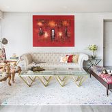
#18: Ignoring accents can lead to a huge room colour mistake
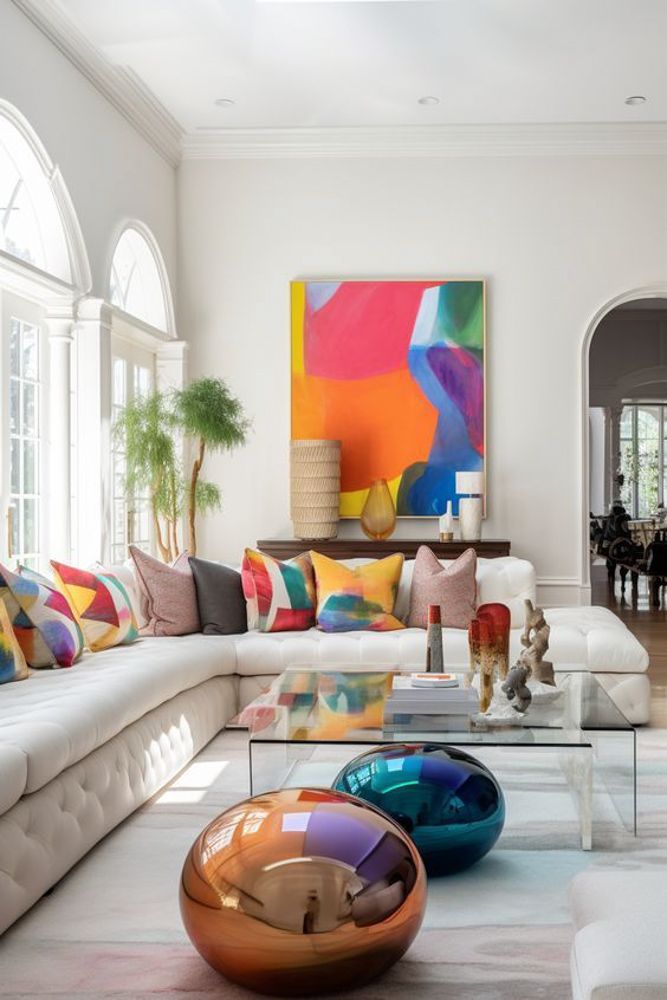
Image credits: Pinterest @MishaAlexisI
Introduce three different accent colours throughout the room. For example, use a vibrant throw pillow, a statement piece of art in a contrasting hue, and a colourful area rug. These unexpected accent colours can make a bold statement. Sometimes, a single, well-placed accent can have a dramatic impact as well. Try painting a single wall a deep, saturated colour or adding a large piece of artwork with vibrant colours.
Pro tip: Don’t just rely on colour! Introduce textural accents like a chunky knit throw blanket, a sheepskin rug, or a woven basket.
#19: Ignoring the floor is a room colour combination mistake 101
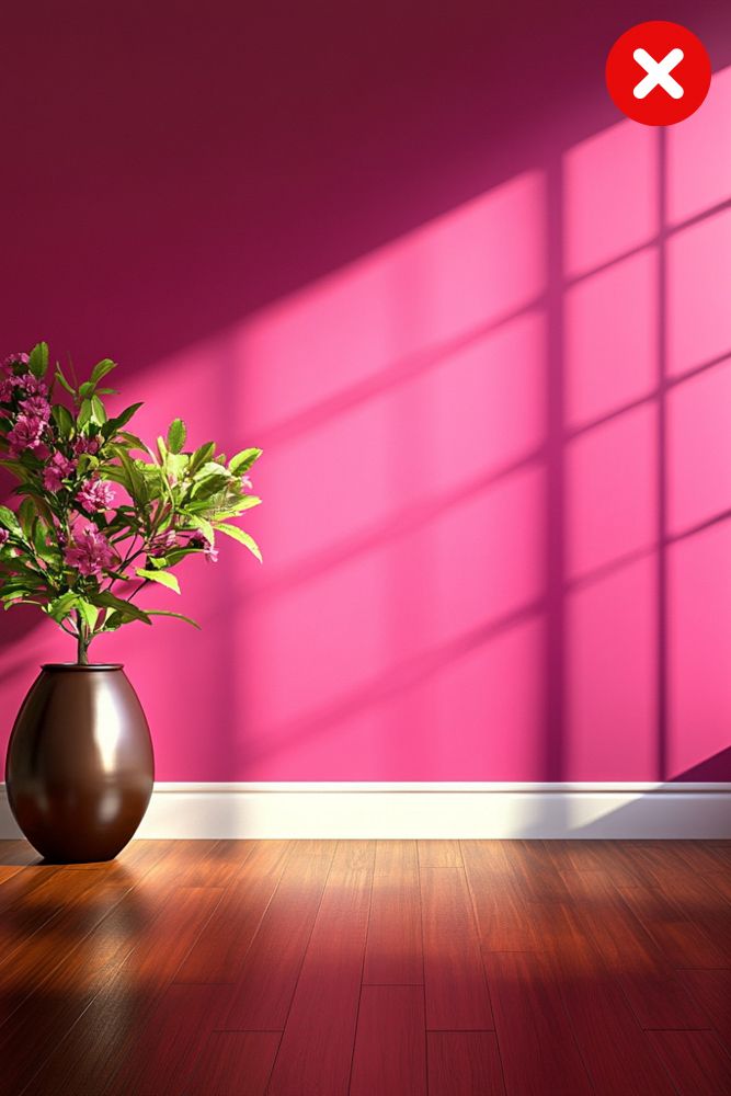
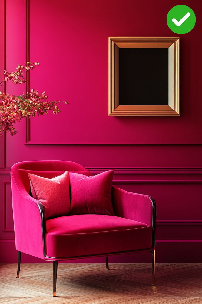
Image generated using AI
You’d be surprised how often the floor gets the short end of the stick in the grand colour scheme drama! Imagine a vibrant fuchsia wall clashing with a deep mahogany floor… yup.
- The “Compliment, Don’t Compete” rule: Choose wall colour combinations that complement your flooring, not compete with it. If you have warm wood tones, opt for earthy greens, warm greys, or soft blues. For cool grey floors, consider crisp whites, icy blues, or even a touch of lavender
- The “Echo” effect: Pull out subtle hints of your flooring colour in your wall colour combination. For example, if you have a beige floor with warm undertones, choose a wall colour combination with a touch of beige or cream in it
- The “Contrast Playfully” game: If you’re feeling adventurous, create a playful contrast. A bold, deep blue wall can pop against a light wood floor, adding a touch of unexpected drama. Just make sure the contrast feels intentional and balanced
Pro tip: Pay attention to the undertones of both your floor and your wall colour. Warm floors (like honey oak) need warm walls (like creamy whites), while cool floors (like grey tile) crave cool walls (like icy blues).
#20: Ignoring the outdoor view is another common room colour combination mistake
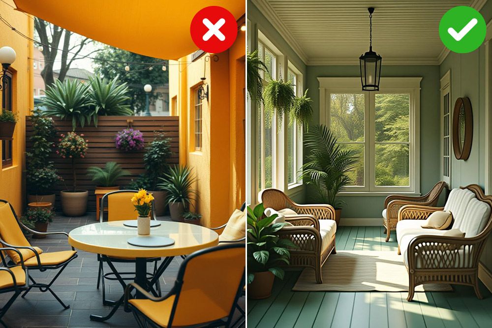
Image credits: Pinterest @YAAMBoutdoors and @decor_angle
Your room is the model, the view is the backdrop, and the colours are the clothes. If you’re blessed with a breathtaking garden, why not bring the outdoors in? Use colours that echo the hues of your foliage – think soft greens, earthy browns, and pops of vibrant blooms.
If your view is a bit more dramatic – say, a bustling city skyline – consider using colours that provide a striking contrast. Think bold reds, deep purples, or even a touch of black to create a sophisticated and edgy vibe.
Pro tip: If your view isn’t exactly postcard-worthy, use colour to draw attention away from it. A bold accent wall on the opposite side of the room can create a focal point and shift the visual focus.
Also Read: 34 Ways to Spruce Up Your Outdoor Balcony Designs
How can Livspace help you?
Phew! That was a whole lot of chaotic room colour combinations you def need to avoid! Our interior designers can help you avoid this mishap with
- 3D realistic renderings that are almost too real
- a whole section of paints, finishes, and textures at your nearest Livspace experience centre
- expert advice on colour coordination and budget
We stand behind our products with a flat 10-year warranty*. Every item we make goes through a rigorous 146-point quality inspection. And with over 100,000 happy #LivspaceHomes, you can trust that we deliver on our promise of quality and customer satisfaction.
Book a FREE consultation with our designer and get a personalised quote today!
*For select finishes on modular products. For full scope of warranty, please visit zonemlb.com/in/service
Disclaimer: All contents of the story are specific to the time of publication. Mentions of costs, budget, materials, finishes, and products from the Livspace catalogue can vary with reference to current rates. Talk to our designer for more details on pricing and availability. The Pinterest images used in this blog are solely for illustrative purposes. We do not claim ownership of these images, and all rights belong to their respective owners. If you are the owner of any image and would like it to be removed or credited differently, please contact us.